


Blending is the one technique that separates a numbered canvas that looks painted from one that looks filled in. It is also the technique most likely to go wrong, because acrylic gives you a narrow window and the instinct when it starts to dry is to keep working it, which is exactly what ruins it.
You do not need it on a first kit. The design works without it. But once you have a canvas or two behind you, this is the thing worth learning next.
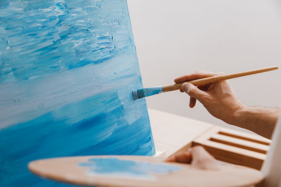
What blending is for on a numbered canvas
Not everywhere. That is the first thing.
The printed lines on a numbered canvas serve two different purposes depending on where they are. On a hard object — a roof, a boat, a window frame, a fence post — the line is a real edge, and it should stay crisp. On a soft transition — sky into cloud, water into reflection, one part of a hillside into another, the turn of a curved surface into shadow — the line is only a printing convenience, and leaving it hard is what makes the canvas look like a diagram.
So the question before every seam is: does this edge exist in the world? If yes, leave it. If no, soften it.
In practice that means blending belongs in skies, water, open fields, snow, distant hills, and the shaded turn of anything round. It does not belong on architecture, foreground objects, lettering, or anywhere two genuinely different things meet.
Wet on wet
The main method, and the one to learn first.
Paint both sections while the first is still wet. Then take a clean brush, slightly damp and pressed out on a cloth so it is not dripping, and stroke it back and forth along the seam a few times — three or four passes, working along the line rather than across it. The two colors mix a little at the boundary and the hard edge disappears.
Two things go wrong here. Too much water, and you thin the paint until the canvas shows through as a pale stripe exactly where you were trying to hide a line. Too many passes, and you drag both colors into an even mush and lose the transition entirely. Stop earlier than feels right — you are aiming for a soft edge, not a third color.
Double loading
Load a flat brush with one color on one side and a second color on the other, then lay it down so both transfer at once, already graded. It gives a soft transition in a single stroke and it is faster than working a seam.
It suits broad areas where you want a gradual shift across a distance — a sky going from deep blue at the top to pale near the horizon, or water lightening toward a light source. Wipe the brush and reload for each stroke, keeping the two colors on the same sides each time, or the gradient reverses halfway across.
Wet on dry
The recovery method. If a seam has already dried hard, you can still soften it by going back over the boundary with a small amount of one of the two colors on a nearly dry brush, feathering it out over the neighbor.
This is also how you fix an over-blended area. If two colors have merged into one flat patch, wait for it to dry completely, then re-establish the lighter side by dragging a little of the light color back in, and the darker side the same way. It works because acrylic is opaque enough to cover itself.
A dry brush with almost no paint on it, dragged lightly, is a genuinely useful tool. Most people load far too much paint on it the first time.
Buying yourself time
Acrylic dries fast, and on a warm day it dries faster. Four things help, in roughly increasing order of effort:
- Work small. Blend one seam at a time rather than painting a whole sky and then trying to soften all of it. The single biggest cause of a failed blend is attempting too much area at once.
- Mist the palette, not the canvas. A fine spray over the paint on your palette keeps it workable. Spraying the canvas gives you runs and diluted color where you least want them.
- Use a stay-wet palette. A damp sponge under a sheet of baking parchment in a shallow lidded box does the same job as the shop-bought version, and it keeps mixed paint usable for days.
- Add a retarder or an acrylic glaze medium to the paint you are blending. This is the proper answer if you blend a lot. Add a little at a time — too much and the paint stays tacky far longer than you want and stays soft under the next section.
Do not thin with more water to keep it open. Past a certain point water breaks down the acrylic film rather than just spreading it, and you get a weak, translucent patch.
Practical notes
- Practice on the canvas edge or a scrap of card before you soften a seam in the middle of a sky. The pale colors in particular behave differently from how they look.
- Let the pale colors have two coats before you blend them. A single thin coat of a light color has the printed number showing through, and blending it just spreads the problem sideways.
- Keep one brush for blending only and keep it clean. A brush with dried paint in the heel splays and will not lay a soft edge.
- Blend after the surrounding sections are in. A transition judged against bare canvas looks completely different once its neighbors are painted.
- Step back. Blending is judged from across the room, not from six inches away. What looks like an obvious hard line up close often vanishes at normal viewing distance, and softening it further is wasted work.
Where paint by numbers actually came from
Since the question comes up in the same breath as technique, it is worth correcting a story that circulates widely. You will read that paint by numbers began with Michelangelo numbering sections of a ceiling for his assistants, or with Leonardo da Vinci setting numbered patterns for his apprentices. There is no evidence for either. Renaissance workshops absolutely did divide work among assistants, but not by a numbered color key.
The real history is much more recent and better documented. Paint by numbers as we know it was conceived in 1949 by Dan Robbins, a commercial artist at the Palmer Paint Company in Detroit, working for the company's owner Max Klein. Robbins later said the idea came to him from the notion of Leonardo assigning numbered sections to apprentices — so the myth is the origin of the origin, which is a neater story than the myth itself.
The kits went out under the Craft Master name and were an enormous commercial success through the 1950s. That is the whole lineage: a paint company in Detroit, seventy-odd years ago.
Where to try it
Skies and water are the forgiving places to start, which makes lake and coastal designs the natural first attempt. Snow is good too — the shadow transitions are subtle and a soft edge flatters them.
Our note on complementary colors explains why two colors mixed at a seam sometimes turn gray on you, and the beginner's guide covers the basics if you are on a first canvas. You can see which designs have the broad soft areas worth practicing on in the full collection, and there is a matched extra paint set for every design if blending has used up more of a sky color than you expected. Which paints suit canvas matters more once you are buying your own.


