


A kitchen is the hardest room in the house to hang a painting in, and it is also the room where people most want one. Warm air, cooking grease, steam from the sink and almost no uninterrupted wall between the cabinets and the window.
None of that rules it out. It just changes what to hang and where to put it.
Where not to hang it
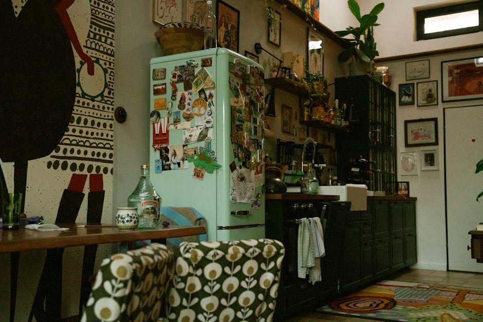
Directly above the range is the one place to avoid outright. Cooking sends a fine film of airborne oil onto every surface near it, and on a painted canvas that film settles into the texture and does not come off with a cloth. A wall on the other side of the room, or the dining end, is a completely different environment even though it is the same kitchen.
Two other things worth keeping in mind. A canvas stretched on a wooden frame reacts to swings in humidity, and a wall that goes from cool to steamy every evening will loosen it slightly over time; if it goes slack, that is what is happening. And a spot in direct afternoon sun will fade any pigment eventually, which is worth a thought before you hang a piece you have spent twenty hours on.
Seal it first
This is the one job worth doing before a finished canvas goes on a kitchen wall. A coat of acrylic varnish over the completed painting gives you a surface you can actually wipe, instead of raw acrylic that holds onto whatever is in the air.
Wait until the painting is thoroughly dry, not just dry to the touch. A week is sensible. Then a thin, even coat, and a second if you want more protection. Matte varnish keeps the flat look of the numbered kit; gloss deepens the colors and reflects more of the room back at you.
Afterwards, cleaning is a dry soft brush most of the time, and a barely damp cloth when it needs more. Nothing with solvent in it. Acrylic and solvent do not coexist, varnish or no varnish.
Size the piece to the wall you actually have
Kitchen walls come in short runs. The gap beside a doorway, the panel above a light switch, the strip between a window and a cabinet. This is one of the few rooms where the smaller 12x16 is usually the better buy, not a compromise.
The framed sizes matter here too. They arrive already stretched on a wooden frame, so there is nothing to mount and no trip to a framer between finishing the painting and putting it up. If you would rather work with the unframed canvas, our guide to framing a paint by number canvas covers the options honestly, including the ones we would not recommend.
Three of our designs that suit the room
Apple Harvest
Apple Harvest is Judy Buswell's painting of a bushel basket of red and yellow apples on a weathered garden table, with a white enamel pot beside it and loose fruit rolling across the boards. Buswell paints in watercolor, so the orchard light behind the fruit stays loose and airy rather than competing with it.
It is the most obviously kitchen-shaped subject we make. Worth knowing before you start: reviewers call it time-consuming, because every apple is individually shaped and shaded into three or four numbered tones. The background goes in fast; the fruit is the work.
October
October is a row of ceramic pitchers and stoneware jugs crowded with zinnias, poppies and cosmos in orange, magenta and soft pink, on a pale tabletop. Warm and sunlit, and it lifts a kitchen that does not get much daylight.
Florals mean a lot of small sections, since every petal is its own shape. The compensation is that a stray brushstroke disappears in a bed of flowers in a way it never would in an open sky.
Ritas Pansies
Ritas Pansies is five pots of pansies in a wrought-iron plant stand against a stone wall, with two white-framed windows behind. Buswell paints flowers the way people actually keep them, by a back door rather than arranged in a vase, which is why it sits well near a kitchen door.
Our reviewers are genuinely split on this one and both sides are right. The wall and the pots are easy. The pansy heads are among the smallest sections in our catalog. One tip that saves a lot of frustration: paint one numbered purple across every pot before you open the next pot of purple. Side by side they separate clearly; matched from memory an hour apart, they will not.
A note on subject
Fruit and flowers are the obvious kitchen subjects and there is a reason they became the convention, but do not let it box you in. A lake at dusk over the table is a better painting than a bowl of lemons you were lukewarm about. You are going to spend ten to twenty hours with whichever one you choose, and that is the consideration that outranks the decor.
The rest of our designs are in the full collection if none of the three above is the one.


