


A paint by numbers kit arrives with its colors already matched to the design, so most of the time you will not need to mix anything. There are three good reasons to start: you have run out of a color, you want to soften a transition between two sections, or you want to change something deliberately.
All three are worth knowing how to do, and the technique is the same.
Two rules before you start
Mix on a palette, never in the pot. Kit pots hold a small amount of a color matched to a specific number, and once you have stirred something else into one there is no getting it back. A ceramic plate, a sheet of glass or a paper plate all work.
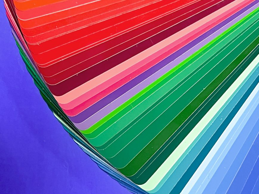
Mix enough for the whole area in one go. This is the tip that saves the most frustration. You will not reproduce a mixed color exactly a second time, and a section finished in two slightly different mixes shows badly. Make more than you think you need.
Why equal parts does not work
Almost every color mixing guide says equal parts blue and yellow make green. Try it and you will get something close to dark blue.
Pigments differ enormously in strength. Blues, particularly phthalo blue, are overwhelmingly powerful. Yellows are weak. A pinhead of blue will change a large pile of yellow, and no amount of yellow will rescue a mix that has gone blue.
Always add the strong color to the weak one, a little at a time. To mix green, start with a pool of yellow and add blue in tiny increments, stirring and checking after each. The same holds for red into yellow for orange, and for anything into white.
It also means you should always mix more of the weak color than you think, because the mix will end up mostly that color by volume.
The basics, briefly
Primary colors are red, yellow and blue, and you cannot mix them from anything else. Secondary colors come from two primaries: red and yellow give orange, blue and yellow give green, red and blue give purple. Tertiary colors come from a primary mixed with the secondary next to it, giving red-orange, yellow-green, blue-purple and so on.
Colors opposite each other on the wheel are complementary, and colors sitting next to each other are analogous. Our guides to the basic color wheel and the paint by numbers color key cover the theory in more depth.
Making a color lighter
Add white, in small amounts, and understand what you are trading. White does not simply brighten a color, it makes it paler and chalkier at the same time. A red plus white is not a lighter red, it is pink.
When you want a color lighter without losing its intensity, the better move is often to mix toward a lighter color of the same family, such as adding lemon yellow to an orange rather than adding white to it.
Making a color darker
Reach for black last, not first. Black flattens a color and drains the life out of it, and mixed into yellow it produces a murky olive that surprises people every time.
Two better methods:
- Darken with the complementary. A little green added to red darkens it and keeps it looking like red. This is how you get shadows that stay colorful rather than going gray.
- Darken with a dark neighbor. Burnt umber deepens warm colors, a deep blue like ultramarine deepens cool ones. Both keep more character than black does.
Muting a color that is too bright
Add a touch of its complementary. Red calms with a speck of green, blue with a speck of orange, yellow with a speck of purple. Push it far enough and any complementary pair neutralizes into a gray or brown, which is how most of the natural-looking colors in a landscape are made.
This is genuinely useful on a kit, because a mixed color that looks too loud next to its neighbors usually needs muting rather than lightening.
Test it, and let the test dry
Acrylic dries slightly darker and duller than it appears wet. A mix that matches perfectly while glistening on the palette can be visibly off once it is on the canvas and set.
Put a swatch on a scrap of paper or card, let it dry fully, and hold it against the area it is going next to. Thirty seconds of waiting saves repainting a section.
Keeping a mix alive
Acrylic on an open palette skins over within about twenty minutes. If you are working over several sessions:
- Mist the palette with water and cover it with an airtight lid or a bag between sittings
- Or use a stay-wet palette, which holds mixed color workable for days
- Write the recipe down. A small swatch on paper with the ratio noted beside it, something like three parts yellow to one part blue plus a speck of white, means you can get close again if you do run out
If you have simply run out
Mixing a replacement for a kit color is possible but hard to match exactly, particularly for the muted tones that make up most of a landscape. There are matched extra paint sets for every one of our designs, which exist for exactly this: a heavily used sky or background color running down before the rest.
Where to take it next
Mixing is the step where a numbered kit starts turning into painting. Once you are comfortable making your own colors, the next things worth learning are blending edges and layering, covered in softening edges on a paint by numbers canvas and layering acrylic paint. The basics of acrylic painting covers how the paint itself behaves.
Our kits come with vacuum-sealed acrylic paints, brushes in a range of sizes and an 11 x 17 reference print, on pre-primed cotton canvas rolled in a tube rather than folded. You can browse the full catalog, or turn a photograph of your own into a numbered canvas with custom paint by numbers from a photo.


