


In normal daylight, the easiest color to see is a yellow-green, at around 555 nanometers. That is where the human eye is most sensitive, which is why safety vests, tennis balls and fire engines in some cities are that particular acid green rather than red.
But the honest answer for anyone with a visual impairment is that hue matters far less than contrast, size and lighting. A large dark shape on a pale background is easier to see than any single color, whatever it is. That is the part worth taking away.
Why green reads brightest
Visible light runs from about 380 nanometers at the violet end to about 700 at the red end. Red has the longest wavelength; violet the shortest.
The retina has two kinds of photoreceptor. Cones handle color and detail and need decent light. Rods handle low light and see no color. There are three cone types, sensitive to short, medium and long wavelengths — roughly blue, green and red.
Green sits where the medium and long cones overlap most, so a green light and a red light of the same physical intensity will not look equally bright: the green will look considerably brighter. It is not that green stimulates all three cones equally — it barely touches the blue-sensitive ones — it is that the eye's overall sensitivity peaks there.
Night is different
In dim light the cones stop contributing and the rods take over, and the rods peak lower down the spectrum, at about 507 nanometers — a blue-green.
The shift is easy to notice. At dusk, reds drain to near-black while blues and greens stay comparatively bright, even though nothing about the objects has changed. A red flower that glowed at midday goes flat and dark at twilight.
So the easiest color to see at night is a blue-green, and it has nothing to do with wavelength length — it is which receptor is doing the work.
Distance and bad weather
This is where red earns its place. Long wavelengths scatter less in fog, rain and dust, so red carries further through poor air than blue does. That is why stop signals, tail lights and warning lamps are red, and why distant hills look blue — the short wavelengths are scattered out of the light reaching you.
Put together: green for brightness in daylight, blue-green at night, red for penetrating distance and weather. There is no single winner, which is why the question has so many contradictory answers online.
Colors outside the range
Beyond red is infrared and below violet is ultraviolet, and we see neither. Infrared can be felt as warmth on the skin, but that is heat, not sight, and ultraviolet cannot be detected by any human sense.
Bees see into the ultraviolet, which is how many flowers carry markings invisible to us that guide pollinators to the center.
There are also colors that exist for us but not in the spectrum. Magenta and purple have no single wavelength — the brain manufactures them when the red and blue ends are stimulated together with nothing in between. Brown is simply dark orange, and pink is a desaturated red.
Vision conditions that affect color
Color vision deficiency
Usually inherited and carried on the X chromosome, which is why it is far more common in men. Prevent Blindness puts it at roughly 8 percent of men and under 1 percent of women.
- Red-green is by far the most common. Protanopia involves the long-wavelength cones, deuteranopia the medium-wavelength ones. Reds, greens, browns and oranges become hard to tell apart.
- Blue-yellow (tritan) is much rarer and affects the short-wavelength cones.
- Monochromacy, seeing no color at all, is rarer still and usually comes with other visual difficulties.
Someone with a color vision deficiency generally sees contrast and detail normally. The problem is telling particular hues apart, not seeing.
Low vision
Reduced vision that glasses or contact lenses cannot correct. It can come from macular degeneration, glaucoma, cataracts or diabetic retinopathy, among others, and how it presents varies a great deal — central vision loss, peripheral loss, general blur, or reduced contrast sensitivity.
The National Eye Institute has clear information on the conditions and on what helps. Anything specific to your own sight is a conversation for an optometrist or ophthalmologist rather than an article.
Contrast beats color
If you are choosing colors so that someone can actually read or use something, contrast is what to work on.
- Light on dark, or dark on light. Black on white, white on black, and yellow on black are the combinations used in magnifiers and accessible displays because they work.
- Avoid neighbors on the color wheel. Blue on purple, or yellow on light green, have too little difference in lightness even when the hues look distinct to you.
- Never let color be the only signal. A red button should also say what it does. A red line on a chart should also be dashed.
- Check it in grayscale. If a combination still separates with the color removed, the contrast is genuinely there.
- Size and light do the heavy lifting. Larger and brighter helps more than any hue choice, every time.
Combinations to avoid: red against green, which is the common deficiency; mid-tones against other mid-tones; and any pairing whose only difference is hue rather than lightness.
Painting when your eyesight is not what it was
This comes up often enough with paint by numbers that it is worth being straightforward about. The printed numbers on a canvas are small, and plenty of people find them hard to read. It is the most common complaint in the whole category, and no manufacturer has really solved it.
What genuinely helps:
- Light, first and above all. An adjustable task lamp with a daylight-balanced bulb, positioned to the side so it does not glare off the wet paint, makes more difference than anything else on this list.
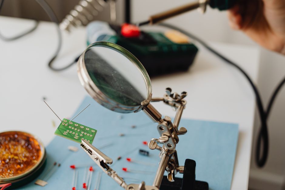
- Magnification. A clip-on lens, a hands-free magnifier on a stand, or a lamp with a magnifier built into it. Many people who paint regularly use one and think nothing of it.
- The reference print. Ledgebay kits include an 11x17 printout of the finished image, which is far easier to read than squinting at the canvas to work out where a section runs.
- Choose the design for its sections, not its subject. Broad skies, water and open landscape have large sections. Dense florals and busy detail have very small ones. The image itself tells you which you are looking at.
- Go bigger. The same design at 16x20 has noticeably larger sections than at 12x16.
- Short sessions. Close work tires the eyes, and tired eyes make the numbers harder still.
In short
Yellow-green is the brightest color to the eye in daylight, blue-green takes over at night, and red carries furthest through weather. For anyone with reduced sight, though, contrast, size and good light matter far more than which hue you pick.
You can see the Ledgebay designs in the shop — the larger, more open landscapes are the easier ones on the eyes — or look through the customer gallery. Our color wheel guide covers which colors sit next to each other and which contrast.


