

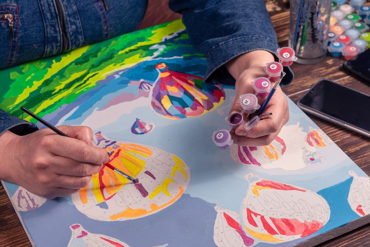
The color guide is the least glamorous part of a paint by numbers kit and the one that decides whether the finished canvas looks right. It is not just a lookup table. It is a record of the decisions an artist made about light, and reading it that way is what turns filling in shapes into painting. The canvas itself — how it is primed, printed and trimmed — decides how much of that comes through.
What the guide actually is
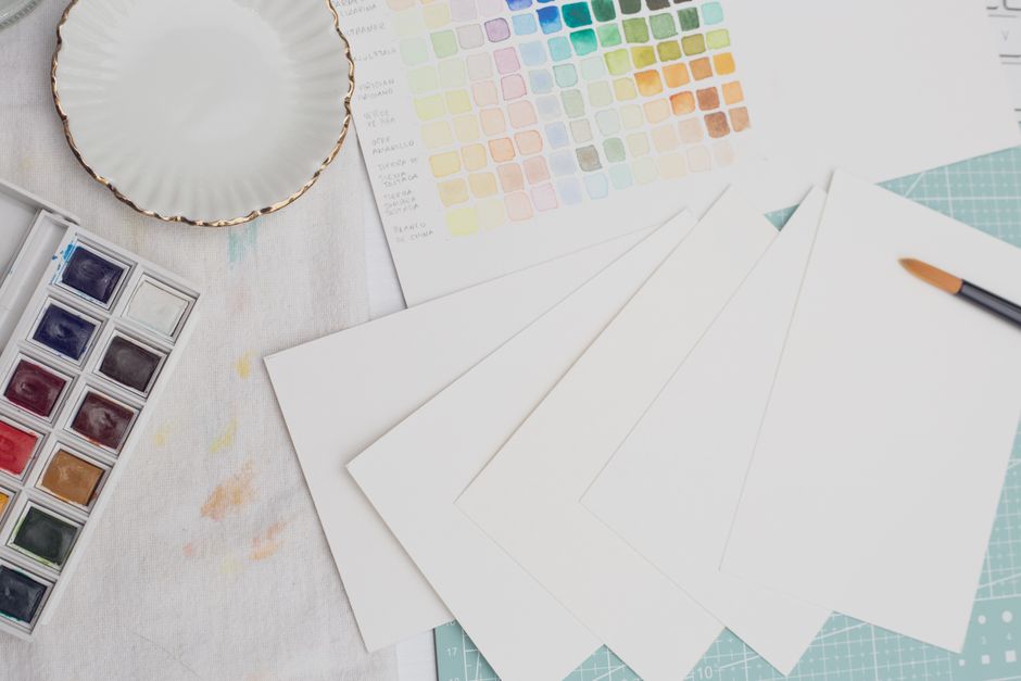
Three things, working together.
The numbered canvas. Every region carries a number printed inside it, usually near an edge where it will be covered first.
The numbered pots. Each pot carries the same number. There is no interpretation involved: pot 12 goes in every region marked 12.
The reference print. Ours is 11 by 17 and shows the finished painting in color alongside the numbered layout. This is the part people use least and need most, because when a number on the canvas is unreadable — under a smudge, at an edge, or simply too small — the print has it.
Why two colors look identical in the pot
This is the most common source of confusion, and it is not a fault in the kit.
Designs frequently include several colors that are genuinely very close — three greens for foliage at different depths, two grays for snow shadow, a pair of blues for near and far water. In the pot they look almost the same. On the canvas, next to their neighbors, they are visibly different, and the difference between them is doing real work: it is what makes the far hillside sit behind the near one.
So the instruction is: do not decide two pots are the same and merge them. If you use one green where three were intended, the depth in the picture flattens out and you will not be able to say why the finished canvas looks like a poster.
Two practical habits help. Paint a small swatch of each similar color on the blank margin outside the printed area and let it dry, so you have a physical reference. And check the pot number against the section number every time, not just when you change color — it takes a second and it is the single most common mistake.
Lighting
Colors that are easy to tell apart in daylight are indistinguishable under a warm bulb, and this bites hardest on dark designs where several deep blues and greens sit together.
Work under a lamp placed to the side rather than overhead, and use a daylight-temperature bulb if you have one. The side placement also throws a slight shadow into the printed lines, which makes the numbers easier to read.
Acrylic dries darker
The binder is milky when wet and clear when dry, so a color looks slightly lighter in the pot than it will on the canvas. Judge a color once it has dried, not while it is wet, and never try to correct a match by adding white — that lightens it permanently rather than fixing anything.
Working order
The guide tells you which color goes where. It does not tell you what order to work in, and the order makes a real difference.
One color at a time, right across the canvas. Finish everything numbered 7 before opening pot 8. It is faster, it stops you losing track, and it gives each area time to dry before its neighbor goes in.
Background before foreground, top of the canvas downward. Your hand then rests on finished areas rather than wet ones.
Darks before lights. This is the one that contradicts a lot of kit instructions, and it is worth being clear about. Pale colors in these kits are thin, and a light color will usually cover a dark one that has strayed slightly over its line. The reverse very rarely works. Any instruction telling you to start light and work dark is borrowing a rule of thumb from oil painting that does not transfer.
Expect two coats on the pale colors. Yellows, creams and pale blues will not hide the printed number in one pass. Let the first coat dry properly rather than working a second into a wet one.
When a color runs low
On most designs one or two colors carry the picture — a sky, a field, a body of water — and those pots run down near the end. If a pot has stiffened rather than emptied, a drop or two of water stirred in with a cocktail stick usually brings it back.
What we would not recommend is trying to recreate a color by mixing the leftovers. Acrylic is very hard to match by eye, it dries darker so you cannot judge the match while mixing, and a slightly-wrong patch in the middle of a large area is more visible than an unfinished one. We keep a matched extra paint set for every design for exactly this situation.
Where deviating from the guide is safe
Once you have a canvas or two behind you, there is room to make a design your own. Some changes are safe and some pull the picture apart, and the difference is worth understanding.
Safe:
- Softening edges. Blending the seam between two sections where the transition is soft in reality — sky into cloud, water into reflection, the shaded turn of a curved surface. This is the single biggest improvement available. Our guide to blending on a numbered canvas covers it.
- Adding a highlight or a deeper shadow at the very end, over dry paint, in a place the design has already established.
- Shifting the whole picture warmer or cooler by a small consistent amount, if you do it evenly across every color.
Risky:
- Swapping one color for one you like better. The colors in a design are chosen in relation to each other, and many pairs are complementary — an orange sunset against a blue sea, warm foliage against a cool sky. Replace one half of a pair and the other half stops working, because the intensity you were enjoying came from the contrast rather than from the pigment. Our note on complementary colors explains the mechanism.
- Merging similar colors, for the reason at the top of this page.
- Changing the darkest dark or the lightest light. Those two anchor the whole tonal range, and moving either compresses everything between them.
Fixing a mistake
Wrong color in a section is the easiest mistake in this hobby to fix. Let it dry completely — properly dry, not touch-dry — then paint the correct color straight over the top. Acrylic is opaque enough to cover itself, and two thin coats blend in better than one heavy one.
What not to do: paint over it with white first to start again. White underneath changes the color that goes on top and you will see the patch. And do not use rubbing alcohol or any solvent to lift it, because acrylic dissolves in both and you will take the surrounding work with it.
Reading the guide as a lesson
The most useful habit, if you want to get something beyond a finished picture: before you start, look at the printed canvas and try to work out which shapes are the shadows and which are the light. You will be right more often than you expect and wrong in instructive ways.
That is the same analysis a painter does in their head when they look at a subject, laid out on the canvas for you to read. Doing it a few times changes how you look at things afterwards, which is more than most hobbies give you for the price.
You can see how different designs use their palettes in the full collection, and if you want to design your own guide from a photograph, our custom kits do exactly that.


