


If you searched for an enchanted rose paint by numbers kit, the honest answer is that we do not make one. The rose under a glass dome belongs to a film that is somebody else's intellectual property, and producing it would need a license we do not hold. Any seller offering that design either holds the license or is infringing it, and it is worth knowing which before you buy.
What we do make is florals — real ones, licensed from working painters. And roses are genuinely worth painting, so below is both what is in the catalog and a straightforward method for painting a rose yourself.
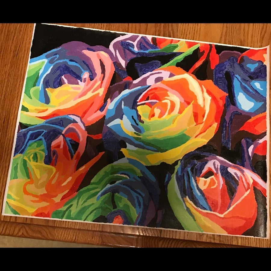
The floral designs we do make
Flowers are one of the better subjects for a numbered canvas, because petals are naturally built from overlapping tonal shapes. That is exactly what the format handles well.
- Rita's Pansies — pansies, and one of the more approachable floral designs.
- Cosmos from the Garden — cosmos, open and airy rather than densely packed.
- Sweet Petunias — worth flagging honestly as one of the more demanding designs we sell. Reviewers say so. Lovely, but not a first canvas.
You can see the rest in the flowers collection. Each comes as a framed 12x16, a framed 16x20 or an unframed 16x20.
If you want a specific bouquet — a wedding arrangement, roses from your own garden — the route is a custom canvas made from your photograph. It is printed in the USA in 12x16, 16x20 and 18x24. Flowers convert well provided the photo has good separation between blooms and is not shot in dappled light.
Painting a rose, step by step
Roses look harder than they are. The trick is to stop thinking about petals and think about a spiral of light and shadow.
1. Start with the shadow, not the outline
Block in the whole bloom as one mid-tone shape first. Do not draw individual petals. Getting the overall silhouette and the direction it faces right matters more than any petal will.
2. Find the center and work outward
A rose is a spiral. The tightest, darkest part is the center, and the petals open and lighten as they move out. Put your darkest tone in the heart of the flower, then work outward in progressively lighter values. This alone makes a shape read as a rose.
3. Petals are edges, not objects
You do not paint a petal. You paint the shadow underneath its curled edge, and the eye supplies the petal. A curved dark stroke under a lighter area reads as a turned edge every time. Fewer, well-placed shadows look far better than many outlined petals.
4. Keep the lightest lights for the top edges
The outermost petal edges catching the light are the brightest points in the flower. Save them for last and leave them properly light. If everything ends up the same value, the rose flattens.
5. Leaves after the bloom
Paint the flower fully, let it dry, then bring the leaves in over the top. Working the leaves around a finished bloom is much harder than laying them across a dry background.
6. Two thin coats, not two thick ones
This is worth stating plainly because the opposite advice circulates. Thick acrylic dries slowly, sits proud of the surface, catches the light unevenly and can crack as it cures. If a color is not covering, let the first coat dry properly and add a second thin one.
Blending on a rose
Roses are one of the subjects where blending genuinely helps, because the transitions across a petal are soft in life.
The method is simple: paint two adjacent tones while both are still wet, then take a clean brush, wipe most of the moisture out of it, and stroke lightly along the boundary between them. Two or three passes and stop. Keep working it and you lift both colors and end up with a muddy band instead of a transition.
What not to blend: the dark center of the bloom, and the edges where one petal overlaps another. Those are real edges and softening them is how a rose turns into a pink blob. Blending on a paint by numbers canvas covers where to do it and where not to in more detail.
Colors that work
A rose rarely needs many. A mid pink or crimson, white, and a deeper red or violet for the shadows will carry most of it. Add a yellow if the rose is warm-toned.
Two things worth knowing. Reds and pinks are often less opaque than other colors, so expect that second coat. And acrylic dries noticeably darker than it looks wet, which matters most on the pale outer petals — judge the balance once everything has dried rather than while you are working.
The color wheel guide covers which combinations stay clean and which turn muddy, which is worth a read before mixing a shadow tone.
Finishing
Let the canvas cure for a couple of weeks before varnishing. Acrylic feels dry within the hour and keeps hardening for far longer, and varnishing too early can cloud it.
If a color has run low before you finish, there is a matching replacement paint set for every design. You can browse the full range in the catalog, or look through the customer gallery to see how the floral designs come out in other people's hands.


