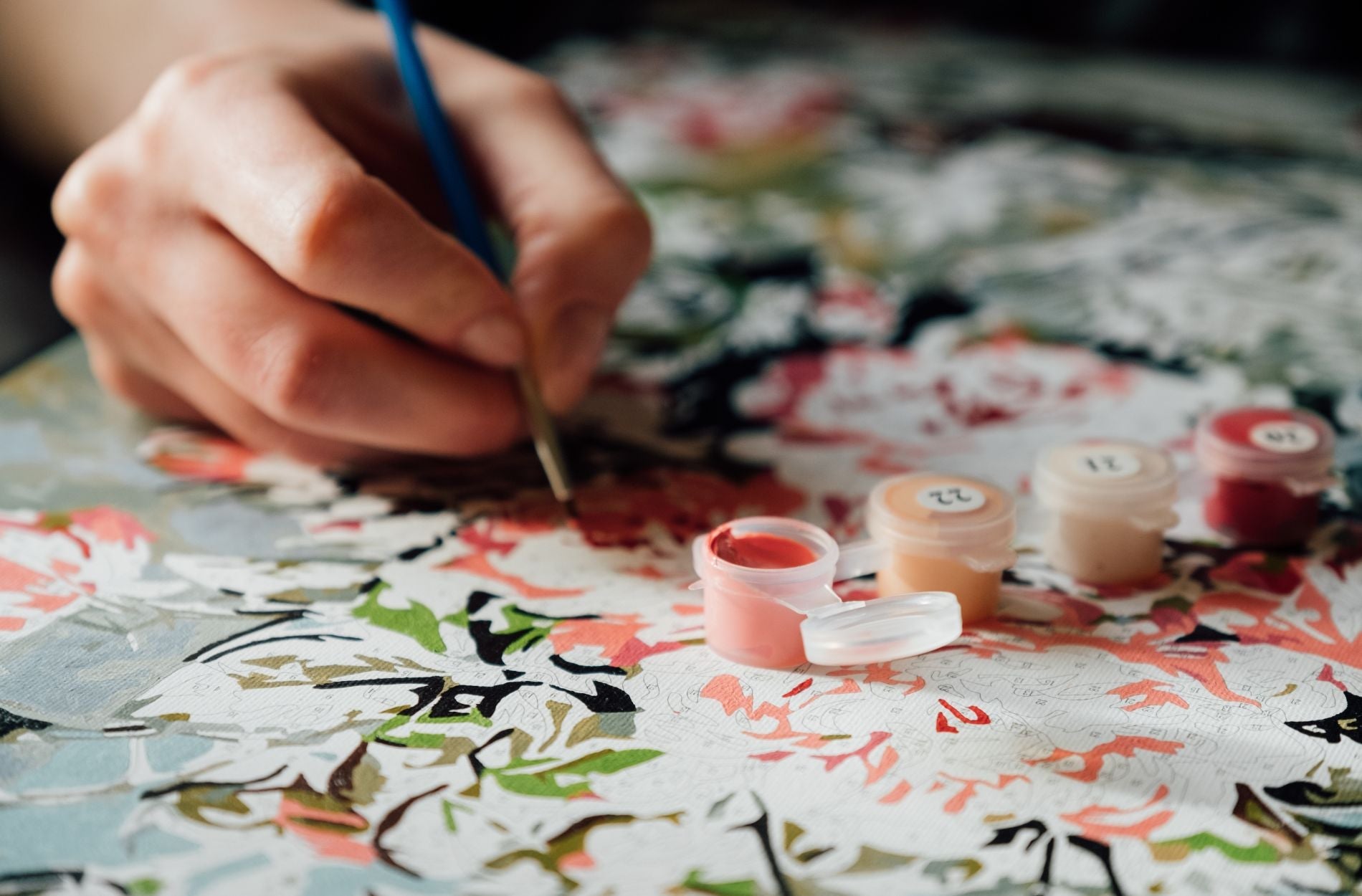
Mixing colors might seem a little intimidating when you first start a paint-by-numbers kit, especially if you’re used to simply dipping your brush into whatever number you're told to. But understanding how different colors come together can make a big difference in how your finished piece turns out. Being comfortable with color mixing adds a new level of creativity and control to your painting.
Whether you're correcting a shade that doesn’t quite match or trying to blend two areas more smoothly, knowing how colors interact can help you get there. This way, the final canvas feels more personal and polished without having to change the design. It also opens up options for adding soft transitions or adjusting tones if the paint dries differently from what you expected.
Basics Of Color Theory
Understanding the basics of color makes your painting feel more natural. It’s not about memorizing rules. It’s about seeing how colors work together so your finished piece looks balanced and smooth.
The color wheel starts with the three primary colors:
- Red
- Blue
- Yellow
These can’t be made by mixing other colors. Everything else can be created from them. When you mix two primary colors, you get a secondary color:
- Red + Blue = Purple
- Blue + Yellow = Green
- Red + Yellow = Orange
Then there are tertiary colors, which are made by mixing a primary with a secondary. For example, red mixed with orange gives you red-orange. These combinations give you more shades that can help you blend sections better or fix colors that don’t quite match what you want.
There’s also such a thing as complementary colors. These sit across from each other on the color wheel, like blue and orange. When placed side by side, they create strong contrast. But when mixed, they often cancel each other out, creating neutral tones like browns and grays. That can be helpful when you need to tone something down or get subtle shadow effects.
Getting familiar with these patterns helps you figure out what happens when you blend two shades or what might go wrong if a color looks off. It also gives you a little more freedom to edit as you go and still stay within the design.
Practical Tips For Mixing Colors
Once you understand the basics, it becomes easier to mix paints with more confidence. Here are some hands-on tips to help:
1. Start By Testing Small
Don’t mix large amounts right away. Try a small bit on scrap paper or the back of your canvas. Let it dry before deciding if it’s the right shade.
2. Keep a Palette Nearby
Using a clean surface like a paint palette or even a paper plate lets you test and blend without surprises. Just make sure it’s white or clear so you can see the color accurately.
3. Use Equal Parts First
Start by mixing equal parts of the two colors. See the result, then shift darker or lighter depending on what you’re aiming for.
4. Add Dark Colors Slowly
Start with the light color and add the dark one bit by bit. Too much dark color can take over quickly.
5. Use a Separate Brush for Mixing
Avoid muddy colors by using a separate brush for blending. If you do double duty with the same brush, rinse it well and dry it before reloading.
6. Keep a Paper Towel Handy
Wipe your brush after every color change. It helps keep your mixes clean and your lines crisp.
7. Note Your Mix Ratios
Anytime you find a color combo that works great, jot it down. It saves you time if you need to make more of the same mix later.
Learning how to mix paint is a smooth process once you break it into small steps. With a little trial and error, you’ll figure out which colors need adjusting and how to control the tone of your project.
Common Color Mixing Challenges And Solutions
Even with prep and planning, things may still go off track. Sometimes your colors look muddy, your mix dries darker than expected, or a shade doesn’t match the spot on the canvas. These kinds of mistakes happen, but they're usually easy to fix.
Muddy colors are often caused by over-mixing or using a brush that still holds old paint. The best way to avoid this is to rinse your brush fully between colors. Keep a paper towel nearby and make sure your palette stays clean while you work.
Here are a few quick problem-solvers:
- Color looks too flat
Add a small touch of a complementary color. This helps bring out depth and can make the shade pop again.
- Shade is too dark or too light
Add white in little by little if you need to lighten it. If it’s too light, add more of the deeper tone slowly so you don’t overshoot.
- Mix doesn’t match the original paint
Paints often dry a shade darker. Wait a few minutes before making a second layer. Once dry, it may match more closely than expected.
If you're trying to paint over a spot that went wrong earlier, go for thin layers of your new mix. Let each coat dry before adding the next. This keeps the canvas texture smooth without streaks.
Planning to paint sections that require the same shade over several sessions? Mix a bit more than you need and store it in an airtight container. It’s tough to remake the same blend later by memory. Tracking your ratios in a small notebook can save you time and frustration.
Slow, thoughtful editing usually works better than fast fixing. Step back and look at your progress once in a while. The mistake you saw up close may not even be noticeable when you look at the full picture.
Enhancing Your Paint-By-Numbers Experience
Once you have a handle on color mixing, painting becomes much more personal. You’re not just filling numbered spaces anymore. You’re creating soft edges, rich tones, and giving the canvas dimension.
Practice outside your main piece using leftover paints or parts of old kits. This lets you try new blends, fades, and balance tricks without pressure. You’ll build your instincts with each test.
Try comparing different versions of the same color mix. That side-by-side view shows how different combos can give you similar results. The more you do this, the more confident you get adjusting colors as you go.
Here’s a relatable moment. A painter working on a beach scene found the blue too bright for the background. By adding just a little orange, the color felt more natural without losing the overall look. It only took one small change, but it pulled the whole project together.
Little color edits like this can shift your paint-by-number from basic to beautiful. It doesn’t change the original design, but it adds your personal flair.
When Color Comes Together
Once you understand how colors work together, your painting experience transforms. You can correct tiny paint errors, get softer blends, and bring life to spaces that once looked too flat or too bold. The goal isn’t perfection. It’s creating results that feel right.
Each color you add becomes part of the story you’re painting. Whether it’s matching a tricky shade, blending a strong edge, or giving a sky more depth, these small moves add up. With every new canvas, you’ll see your color mixing skills grow—and your projects will look better each time.
Ready to take your painting skills a step further? Check out our detailed paint-by-numbers guide from Ledgebay, packed with practical tips and simple techniques to help you create smoother blends and more polished results with every canvas you complete.