


Ground is where most beginner landscapes fall apart. The sky gets attention, the trees get attention, and then the bottom third of the canvas becomes a flat brown shelf that the whole picture sits on top of rather than in.
Fixing that is mostly a matter of two things: getting the colors right, and building it in layers instead of one pass.
First, Two Different Meanings of "Ground"
Worth separating, because they get muddled constantly and the advice for one is wrong for the other.
- The ground in a painting — earth, soil, sand, a path, a forest floor. That is what this article is about.
- A ground, in the technical sense — the primed or toned surface you paint on, as in "gesso ground" or "toned ground".
Both matter here, and they interact, but they are not the same thing.
What Earth Is Actually Made Of
Most people paint dirt brown because they think dirt is brown. Go and look at some.
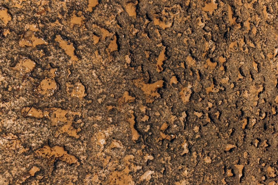
Soil color comes from its minerals. Iron oxide makes it red or orange. Limestone makes it pale gray or nearly white. Decomposed organic matter makes it almost black. Wet earth is two or three values darker than dry earth a foot away.
The practical version: ground is never one color. If you can only see one, you are looking at the idea of dirt rather than at dirt.
Before You Start: Tone the Canvas
Cover the white canvas with a thin wash of a neutral — burnt sienna, raw umber or a warm gray — and let it dry before you start.
This is worth doing and it takes two minutes. White canvas makes every color you mix look darker than it really is, so you consistently mix too light. A toned canvas also glows through the gaps in later layers, which is a large part of why a painting looks unified rather than assembled.
For ground specifically, an earth-toned canvas means the color showing through the gaps is already the right family.
Choosing Your Colors
Pick the palette from the type of ground, then mix everything from those few colors so the whole area stays related.
- Forest floor: burnt umber, burnt sienna, sap green, yellow ochre. Dark, warm, and broken up by leaf litter.
- Dry earth or a track: yellow ochre, burnt sienna, titanium white, a touch of ultramarine for the shadows.
- Beach sand: yellow ochre and white, with ultramarine in the damp areas. Wet sand is far darker than dry sand and this contrast is most of what makes a beach read.
- Desert: yellow ochre, cadmium orange, burnt sienna, white.
- Snow: mostly white with ultramarine and a little violet. Almost no pure white except where the sun hits directly.
Never use black to darken earth. It goes gray and dead. Darken brown with its complement — a little blue or violet — and the shadow stays alive.
The Layers, In Order
1. Block in the mid-tone
Cover the whole ground area with your middle value — not the darkest, not the lightest. Use a large brush and do not fuss with it. This layer will barely be visible when you finish, and that is fine.
2. Establish the shadows
Add the darks next, while you can still see the whole shape. Shadows on ground follow the contour: they pool in the dips and disappear over the rises. Keep them warm rather than gray.
Decide where the light comes from before this step and do not change your mind afterwards.
3. Bring up the lights
Lighter, warmer notes on the raised areas and wherever the light strikes directly. This is where the ground starts reading as a surface with shape rather than a flat panel.
Use less than you expect. A few well-placed light strokes do more than a general lightening.
4. Texture, with a dry brush
The technique that does most of the work. Take a stiff brush, load a little paint, wipe most of it off on a cloth, then drag it lightly across the surface. It catches the tooth of the canvas and leaves broken, granular marks — which is exactly what soil looks like from a few feet away.
Stippling with the tip of the brush gives a sandier effect. A palette knife scraped sideways gives gravel and stone.
5. Detail, sparingly
A few stones, a handful of grass blades, a rut or a footprint. Put them in the foreground only. Detail in the distance flattens the picture; detail near the viewer is what tells them how far away everything else is.
Three or four convincing stones beat thirty vague ones.
Three Things That Give Beginners Away
- Uniform color. One brown across the whole bottom third. Break it up, even subtly.
- Uniform texture. Ground is smoother in the distance and rougher up close, in the same way it is less detailed further away. Vary the brushwork accordingly.
- A hard horizon line where the ground meets everything else. Grass meeting a path, or earth meeting a wall, should be a slightly broken edge, not a ruled one.
Which Paint
Acrylic is the practical choice. It dries in minutes, so you can put the next layer over the last within the same session, and layering is the whole method here.
Oil gives richer earth colors and blends beautifully, at the cost of days between layers and a solvent setup. Worth it if you already work in oil.
Watercolor is a different discipline: you work light to dark and reserve the white of the paper, so nearly all the advice above runs backwards.
On brands, any of Liquitex Basics, FolkArt, M. Graham or Golden Heavy Body will do this well. Golden's heavy body holds a dry-brush mark best; FolkArt is the cheapest way to get a lot of earth colors.
One correction worth making
You may read that a glossy finish suits ground. It does not — that advice comes from house paint, where gloss is about washability. A high gloss on a landscape produces glare that hides the very texture you spent an hour building. Use a matte or satin varnish, and only once the painting is fully cured.
Practising the Idea
If you want to see how a professional handled ground before painting your own, a numbered kit is a decent way in: the values and color breaks are already worked out, so you can watch the earth build up section by section and see where the darks were placed.
The Road Home and Northwoods Retreat both have a lot of ground in them, and the full catalog is here.
Then come back to a blank canvas. Our acrylic landscape tutorial covers the whole picture from sky down, and passive and active colors explains why the warm notes belong in the foreground.


