


A beach scene is one of the easiest landscapes to paint, because at heart it is three horizontal bands: sky, sea, sand. Get the proportions and the order right and the painting largely makes itself. Get them wrong and no amount of careful brushwork will rescue it.
Here is how to paint one in an evening, in the order that works, with the handful of decisions that actually matter.
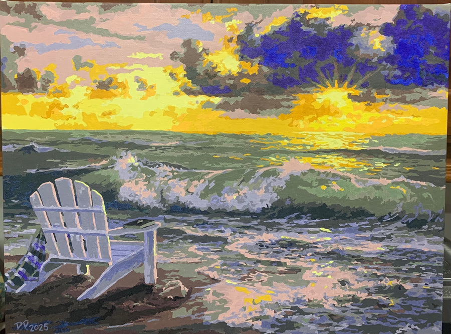
What you need
- A canvas. An 11 x 14 or 16 x 20 is a comfortable first size.
- Acrylic paints: a blue, a white, a warm tan or yellow ochre, a brown, and ideally a second darker blue.
- A wide flat brush for the broad bands, a medium round, and a small round for detail.
- A palette or a paper plate, a jar of water, and paper towels.
- A pencil, if you want to mark the horizon before you start.
That is genuinely all. Beach scenes need very few colors, and a limited palette is part of why they look coherent.
The decision that matters most: where the horizon goes
Do not put it in the middle. A horizon across the center of the canvas splits the picture into two equal halves and the eye has nowhere to settle.
Put it roughly a third of the way down if you want a big sky with weather in it, or a third of the way up if you want the beach itself to be the subject. Mark it lightly in pencil before any paint goes on, and use a ruler or the edge of your flat brush to keep it level. A sloping horizon is the single most noticeable error in a seascape, because everyone knows what a real one looks like.
Step one: the sky
Work top down, and start with the deepest blue at the very top of the canvas. As you move toward the horizon, add more white to the mix so the blue gets progressively paler.
This is not decoration. It is how sky actually behaves: there is more atmosphere between you and the horizon than between you and directly overhead, so distant sky is paler and slightly hazier. Reproducing that one gradient is most of what makes a painted sky look convincing.
Work quickly with a wide flat brush and let the bands blend into each other while the paint is still wet. Acrylic gives you a couple of minutes, so mix all your sky tones in advance rather than mixing as you go.
For clouds, load a little white on a dry-ish brush and dab rather than stroke. Keep them larger and higher on the canvas, smaller and flatter as they approach the horizon, for the same reason the blue pales.
Step two: the sea
The sea is generally darker at the horizon and lighter as it comes toward you, which is the opposite of the sky. Deep water at a distance reads as a dark, cool band; shallow water over pale sand near the shore reads lighter and greener.
Lay the dark band in first with a flat brush, keeping the top edge crisp against the horizon. Then work forward with progressively lighter, warmer mixes.
The perspective rule that sells a seascape: wave lines get taller and further apart as they come toward you. Near the horizon they are thin, closely stacked horizontal marks. In the foreground they are broad, well-separated shapes. Painting waves the same size all the way up flattens the water instantly.
Step three: the sand
Sand is two different colors, and treating it as one is why beach paintings often look like carpet.
Wet sand, in the band where the water has just retreated, is darker, cooler and slightly reflective — it mirrors the sky, so it takes some of your pale blue. Dry sand further up the beach is lighter and warmer, tan with white mixed in.
Put the wet band in first, then the dry, and let them meet in a slightly ragged line rather than a straight one.
For texture, use a nearly dry brush: load it, wipe most of the paint off on a towel, then drag it lightly across the surface so the paint catches on the weave of the canvas and leaves gaps. That broken, grainy effect is what reads as sand from a step back. Dabbing works too, but keep it light — heavy stippling looks like gravel.
Step four: foam and highlights
Leave this until everything else is dry, and use less white than you want to.
Foam sits where the wave breaks and in a thin, uneven line along the water's edge on the sand. Apply it with a small brush and a light touch, and break the line up — a continuous unbroken stripe of white looks like a painted line, not like water.
Save the very brightest white for two or three places only. Highlight everywhere is the same as highlight nowhere.
Step five: whatever else belongs
Birds, a distant sailing boat, footprints, a few shells, dune grass. All optional, all easy to overdo.
Two rules if you add them. Keep them small — anything you put in the foreground has to be painted well, whereas a bird two brush-flicks wide reads perfectly. And keep them off the center, so they lead the eye across the picture rather than pinning it in the middle.
A fan brush earns its place here for two things specifically: dragging out dune grass, and breaking up the edge of foam. Those are the jobs it is good at.
Fixing what goes wrong
Muddy water. Almost always caused by working back into paint that is half dry, which drags the layer underneath and mixes it. Stop, let it dry completely, and repaint over the top. Acrylic is opaque, so a dried mistake is a clean slate.
Paint too thick or slightly dried in the pot. A drop of water and a good stir usually brings it back. Do not thin so far that it stops covering.
A color you regret. Wait for it to dry, then repaint with the color that should be there. Do not try to cover it with white first — white acrylic is less opaque than people expect, it needs several coats, and it tints everything you put over it afterward.
The horizon is not level. Fix it now rather than working around it. Let the area dry, lay a strip of low-tack tape along a properly measured line, and repaint the sky edge against it.
One thing to expect rather than fix: acrylic dries slightly darker than it looks wet. Judge every mix after it has dried, not while it is on the brush.
Sealing it
Once the painting is fully cured — days rather than hours for thick passages — a coat of acrylic varnish will protect the surface and even out the patchy sheen you get where some areas were thinned more than others. Matte, satin or gloss is a matter of taste. It is optional, and it does make a finished piece look finished.
If you would rather not draw it
The composition is the part that stops most people, and it is the part a numbered canvas removes. If you want a coastal scene on the wall without deciding where the horizon goes, we have several: Seaside Escape and Seaside Paradise are beach scenes, Moonlight Bay and Still Waters are quieter water. Worth knowing that Seaside Paradise is one of our more demanding canvases — a lot of small sections — so it suits someone who has painted before.
You can see all of them in the kit collection. If it is your own stretch of coast you want, a custom canvas from your photo will do that instead.
And if you want to go further into freehand technique, our guide to layering acrylic paint covers building up tone in stages, which is exactly what a good sky needs.


