


An elephant is one of the best subjects a beginner can pick, and the reason is the silhouette. Ears, trunk, the curve of the back. Get those three right and a viewer will read it as an elephant no matter what colors you use, which is exactly the freedom that makes a stylized version work.
Before anything else, though, it is worth being clear about what you are making.
Two Different Things Get Called Abstract
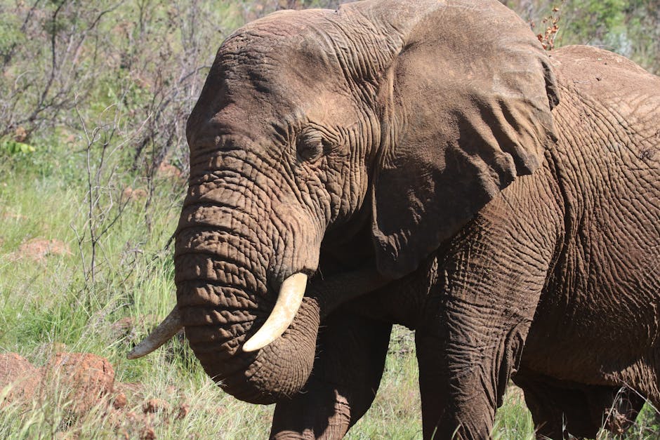
Strictly, abstract art does not depict anything. There is no elephant in it. Most people searching for an abstract elephant painting do not want that. They want a recognizable elephant in unrealistic colors, with visible brushwork and a loose background.
That is stylized, not abstract, and the distinction matters because it tells you what to do. In a stylized piece the drawing still has to be right. The elephant has to look like an elephant. Only the color and surface are free.
If you genuinely want non-representational work, none of the shape advice below applies and you can skip to the palette section, which does.
Getting the Shape Down Without Being Able to Draw
This stops more people than any other part, and it does not need to. Nobody is judging how the outline arrived.
- Trace from a printout. Print a photograph at the size you want, put graphite transfer paper underneath, and go over the outline with a stylus or a spent ballpoint. Ten minutes, and it will be accurate.
- Cut a paper template. Print the elephant, cut around it, lay it on the canvas and draw around the edge. This gives you a strong, simple silhouette, which suits a stylized piece better than a fussy traced one.
- Use the grid method. Light pencil grid on the photo and on the canvas, then copy square by square. Slower, needs nothing, and it does teach you to see shapes rather than objects.
Keep the pencil light whichever way you go. Heavy graphite shows through pale acrylic and does not come off afterward.
Two details are worth checking before you commit. The ear should meet the head high, roughly level with the eye, not low on the neck. And the back should dip behind the shoulder rather than running straight. Those two are what separate a convincing elephant from an odd gray shape.
Choose a Limited Palette
This is the single decision that determines whether the finished piece looks considered or chaotic, and beginners almost always use too many colors.
Three or four colors is plenty. A workable structure:
- Two colors that sit opposite each other on the color wheel, for the elephant and the background. Orange and blue, or violet and yellow. Opposites make each other look stronger, which is why they carry a whole painting.
- One dark for the shadowed side and the deepest creases. Not black. A very dark version of one of your two colors reads as shadow while black reads as a hole.
- One light for the top of the back, the top edge of the ear and the ridge of the trunk.
The reason to stay limited is practical rather than aesthetic. Every extra color is another mix, and with acrylic drying in minutes, more mixes means more chances to muddy something. Muddy is what happens when colors from opposite sides of the wheel get stirred together by accident. Our guide to the color wheel covers which pairs do that.
The Order to Work In
- Background first, all of it, right up to and slightly under the elephant's outline. Painting the background around a finished elephant leaves a white halo you will spend an hour chasing.
- The elephant flat, in its mid tone. One even coat over the whole animal. It will look like nothing at this stage. That is expected.
- Shadows next. Under the belly, the far side of the trunk, behind the ear, under the jaw. This is the step where it suddenly becomes solid.
- Lights last. A few strokes along the top of the back, the outer curve of the ear, the ridge of the trunk. Light acrylic covers dark acrylic far more easily than the reverse, which is why they go last rather than first.
- Texture at the very end, if you want it. Wipe most of the paint off a brush and drag it dry across the dried surface. It catches on the weave and reads as hide.
Where It Goes Wrong
Overworking. The most common failure by a distance. A stylized elephant is finished long before you think it is. If you find yourself softening the same edge for the third time, put the brush down.
Every area shouting equally. If the background is as bright and busy as the elephant, the eye has nowhere to rest. Pick one thing to be loud and let the rest be quiet.
Trying to blend like oils. Acrylic gives you a minute or two of open time. Long soft gradients are not really available. Work the join fast while both colors are wet, or place a third color between them and let the edge stand.
Black for shadow. Worth repeating, because it is what makes amateur work look flat.
Sign It
Lower corner, finest brush, in a color you already used elsewhere so it sits in rather than jumping out. Then date it on the back. It takes a minute and it is the part you will be glad of later.
If You Would Rather Not Draw At All
Plainly: we do not make an elephant kit, and we do not make an abstract range. Our catalog is licensed original artwork, mostly cabins, coastlines, wildlife and florals, and it would be no help to pretend otherwise.
What we do make, if the drawing is the part you want to skip, is numbered kits from your own photograph, printed in the USA. That covers the case where the elephant you want is one you actually photographed. And if you would just like a numbered canvas of something we already draw, the catalog is here.
Either way, the palette and working-order advice above still applies. Our beginner's guide covers the rest.


