Ever wondered how artists manage to choose the perfect colors tofinish their paintings ? How do all the basic color wheel colors compliment each other to make some elements stand out? This can be explained by the color theory, so stay tuned to learn more.
Firstly, getting familiar with the color theory is essential forpainters and those who aspire to improve their painting skills. Keep on reading to learn more about the basic color wheel and how it can be used.
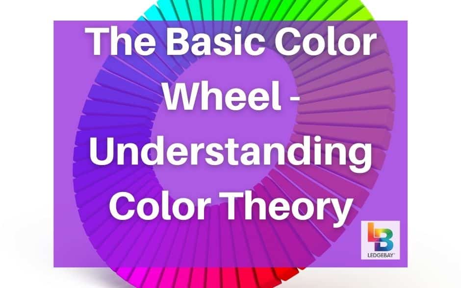
Thecolor theory is a set of rules that combine art and science to determine which colors look best together.Isaac Newton invented the color wheel in the 17th century, when he mapped the color spectrum into a circle to show the relationship between colors.
Color harmony refers to the different colors and how they look together. These are the colors used by painters, designers, and other artists to create a specific look or feeling. Some colors create a pleasing effect when combined together, while others make you feel intrigued.
Painters use the RYB wheel when they paint pictures, while the RGB and Canva’s color wheels are used online by designers. But, all color wheels work in the same way as they analyze the different color combinations and how they affect the mood.
With a specific idea for apainting , apainter always has to think about the different color combinations and how they will work to make the picture express a specific feeling. Some color palettes can immediately evoke feelings of happiness, positivity, and good vibes, so they’re common inpaintings that show nature scenes, people, children, and all the other feel-good elements.
Some color palettes can contribute to feelings of calmness and peace. Secondly, looking at a drawing that incorporates these colors will immediately make you feel comfortable and at peace because the colors soothe you and make you relaxed. Other palettes can be too provoking, as a result forcing you to focus on specific elements in the drawing or thinking about a particular event.
Different color combinations work to enhance the feeling you want tocreate with your painting or drawing. Whether you’re using these colors to redecorate a room, create an elegant outfit, or simply want tochoose new colors for a new painting .
Even with stronger colors like red, the color gradient is used to emphasize a special feeling that the artist is trying to send through his artwork project. Monochromatic color combinations have a harmonious look as you add more shades to emphasize the effect.
This is why most artists choose to pick one color as the dominant one and use the other two as accents. The other colors won’t have such a strong effect but would still compliment the look.
The color palette created using a Triadic color combination is extremely versatile, and creating a vibrant effect that can be used in creating outfits, redecorating rooms, andpainting pictures . It’s not as expected as others, so it’s more suitable for contemporary and industrial-style looks.
This combination can be a little bit tough to master, for instance, if you’re a beginner artist. But the better you become, the easier it will be to work with multiple colors.
Firstly, all the 12 colors on the color wheel are divided into three categories. These are the primary, secondary, and tertiary colors. The primary colors are the ones that combine together to create the white light. These are red, blue, and yellow.
When you combine two primary colors, you get one secondary color. These are purple, orange, and green.
When you combine a primary color with a secondary one, you get a tertiary color. These are red-orange, yellow-orange, blue-green, yellow-green, red-violet, and blue-violet. The colors are different in the RGB color wheel, but the idea is the same.
All these colors can be divided into warm and cool colors. The color temperature refers to the warmth or coolness of the color.
In some cases, for instance, artists will choose to focus on a palette of only warm colors to add asense of warmth , happiness, coziness, energy, and joy. Hot colors can also be used to show intense emotions like anger and frustration, while cool colors evoke feelings of peace, calmness, and serenity. In an extreme state, however, they can be used to show a sense of mystery or loneliness.
Color combinations combine warm and cool colors to create balance. Warmcolors from red to yellow are quite common in paintings that are meant to increase energy, so they can be used in a picture that you hang in the dining room. Bright colors like yellow, red, and orange will add more energy to your space. And ensure that it will never feel empty.
On the other hand, cool colors are said to spread peace and comfort. For instance, using a combination of blue and green in apainting that you hang in the living room or bedroom is most likely going to make you feel relaxed. This is why these colors are used in scenes that represent nature. Because you can calm your mind as you look at the shades of the sky, water, and trees.
The color wheel is the base that you can use when you’re redoing a room. Or whencreating a painting , or simply adding different elements to your space. The color theory focuses on the relationship between different colors. And you can use this knowledge to create more harmony and balance.
Whether the colors are shades of the same basic colors or contrasting shades, they can all be used in a single object that makes your space pop with life and emotions.
CLICK HERE to browse our complete selection of acrylic paint by numbers kits!
Firstly, getting familiar with the color theory is essential forpainters and those who aspire to improve their painting skills. Keep on reading to learn more about the basic color wheel and how it can be used.
What is the Color Theory?
[amazon box="1600583024"]Thecolor theory is a set of rules that combine art and science to determine which colors look best together.Isaac Newton invented the color wheel in the 17th century, when he mapped the color spectrum into a circle to show the relationship between colors.
Color harmony refers to the different colors and how they look together. These are the colors used by painters, designers, and other artists to create a specific look or feeling. Some colors create a pleasing effect when combined together, while others make you feel intrigued.
Painters use the RYB wheel when they paint pictures, while the RGB and Canva’s color wheels are used online by designers. But, all color wheels work in the same way as they analyze the different color combinations and how they affect the mood.
Basic Color Wheel - Different Color Combinations
[amazon box="B07R3TP9DG"]With a specific idea for apainting , apainter always has to think about the different color combinations and how they will work to make the picture express a specific feeling. Some color palettes can immediately evoke feelings of happiness, positivity, and good vibes, so they’re common inpaintings that show nature scenes, people, children, and all the other feel-good elements.
Some color palettes can contribute to feelings of calmness and peace. Secondly, looking at a drawing that incorporates these colors will immediately make you feel comfortable and at peace because the colors soothe you and make you relaxed. Other palettes can be too provoking, as a result forcing you to focus on specific elements in the drawing or thinking about a particular event.
Different color combinations work to enhance the feeling you want tocreate with your painting or drawing. Whether you’re using these colors to redecorate a room, create an elegant outfit, or simply want tochoose new colors for a new painting .
Complimentary
Contemporary and modern artists usuallyuse complimentary colors . These are two colors that are on the opposite sides of the color wheel, showing the high contrast between them. When used, these combinations create an intense effect with a precise statement, which compliments the aesthetics of contemporary designs.Monochromatic
These color combinations focus on different shades of the same base color. Shades of green, blue, or brown are calm, peaceful and create a subtle effect of calmness without being too loud. They also cause some feelings of mystery, especially with the darker shades that leave a lot to the imagination.Even with stronger colors like red, the color gradient is used to emphasize a special feeling that the artist is trying to send through his artwork project. Monochromatic color combinations have a harmonious look as you add more shades to emphasize the effect.
Analogous
In this color combination, the artists choose to incorporate three different colors that are located adjacent to each other on the color wheel. Having three colors in a single combination can make your drawing, art project, outfit, or even room look too crowded with too many details that you need to focus on.This is why most artists choose to pick one color as the dominant one and use the other two as accents. The other colors won’t have such a strong effect but would still compliment the look.
Triadic
In this color combination, theartist uses three colors , but they’re not adjacent to each other on the color wheel. The colors are evenly spaced, with one or two colors on the color wheel to provide high contrast and create a strong effect.The color palette created using a Triadic color combination is extremely versatile, and creating a vibrant effect that can be used in creating outfits, redecorating rooms, andpainting pictures . It’s not as expected as others, so it’s more suitable for contemporary and industrial-style looks.
Tetradic
Four colors that are evenly spaced on the color wheel can be used tocreate this vibrant effect . A Tetradic effect can be difficult, so in many cases, painters and artists usuallychoose only one color to be the dominant one. Also, other colors are used as accents, and tend to be easier to work with.This combination can be a little bit tough to master, for instance, if you’re a beginner artist. But the better you become, the easier it will be to work with multiple colors.
Basic Color Wheel - Primary, Secondary and Tertiary colors
[amazon box="B07Z98ZH83"]Firstly, all the 12 colors on the color wheel are divided into three categories. These are the primary, secondary, and tertiary colors. The primary colors are the ones that combine together to create the white light. These are red, blue, and yellow.
When you combine two primary colors, you get one secondary color. These are purple, orange, and green.
When you combine a primary color with a secondary one, you get a tertiary color. These are red-orange, yellow-orange, blue-green, yellow-green, red-violet, and blue-violet. The colors are different in the RGB color wheel, but the idea is the same.
All these colors can be divided into warm and cool colors. The color temperature refers to the warmth or coolness of the color.
Warm and Cool Colors
[amazon box="B07MC1GDX5"]In some cases, for instance, artists will choose to focus on a palette of only warm colors to add asense of warmth , happiness, coziness, energy, and joy. Hot colors can also be used to show intense emotions like anger and frustration, while cool colors evoke feelings of peace, calmness, and serenity. In an extreme state, however, they can be used to show a sense of mystery or loneliness.
Color combinations combine warm and cool colors to create balance. Warmcolors from red to yellow are quite common in paintings that are meant to increase energy, so they can be used in a picture that you hang in the dining room. Bright colors like yellow, red, and orange will add more energy to your space. And ensure that it will never feel empty.
On the other hand, cool colors are said to spread peace and comfort. For instance, using a combination of blue and green in apainting that you hang in the living room or bedroom is most likely going to make you feel relaxed. This is why these colors are used in scenes that represent nature. Because you can calm your mind as you look at the shades of the sky, water, and trees.
Basic Color Wheel - Wrap Up
[amazon box="B08V4GXMBG"]The color wheel is the base that you can use when you’re redoing a room. Or whencreating a painting , or simply adding different elements to your space. The color theory focuses on the relationship between different colors. And you can use this knowledge to create more harmony and balance.
Whether the colors are shades of the same basic colors or contrasting shades, they can all be used in a single object that makes your space pop with life and emotions.
CLICK HERE to browse our complete selection of acrylic paint by numbers kits!