


We do not have a giraffe in the range. Our only exotic animal is Bamboo Tiger, and the rest of the wildlife is North American: hummingbirds, swans, bluebirds, a bald eagle. So if a giraffe is specifically what you want, the honest route is a custom kit made from a photograph.
Which is worth doing carefully, because a giraffe is a more interesting painting problem than it looks.
The patches are the whole subject
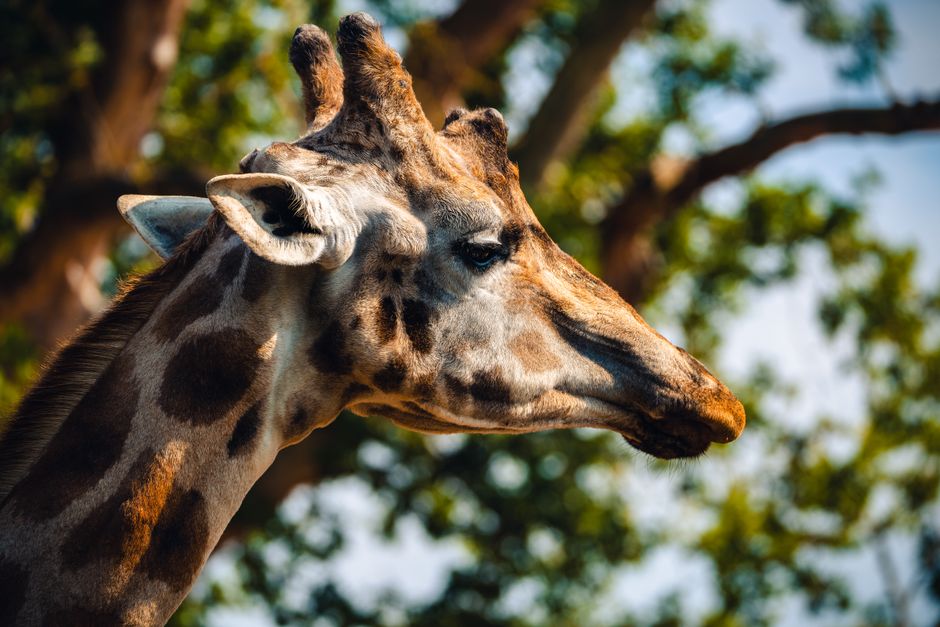
People approach a giraffe as a brown-and-cream animal and paint the patches as flat brown shapes on a pale ground. That is what produces a giraffe that looks like a diagram.
Three things are actually going on.
The patches vary in warmth and darkness. Not one brown. Some run reddish, some closer to olive, some almost black on an older animal. A numbered kit will give you several browns for exactly this reason, and using them where they are marked rather than treating them as interchangeable is what stops the coat looking printed.
Each patch has a pale edge. The cream channels between the patches are narrow, continuous, and lighter than the general body color. They form a net across the whole animal. Keep them clean and unbroken and the pattern reads correctly. Let a wet brown bleed into them and the coat turns to mud, which is the single most common way this subject fails.
The patches wrap. This is the part that creates the illusion of a solid animal. A patch on the front of the neck faces you and looks like its true shape. The same patch on the side of the neck is compressed into a narrow sliver because it is curving away from you. That compression at the edges is what makes the neck look round rather than flat, so resist any urge to even the shapes out.
The neck is a cylinder
Underneath the pattern, a giraffe's neck is a tube lit from one side. There is a lighter band down one edge, a broad mid tone, and a shadowed edge on the other side, and every patch sits within that gradient rather than ignoring it.
If the kit gives you a lighter and a darker version of the same brown, that is what they are for. The patch on the lit side of the neck is genuinely a different color from the identical patch on the shaded side.
The head is where the likeness lives
Two features carry the whole animal, and both are small.
The eyes. Giraffes have large dark eyes and remarkably long lashes, and the eye is where a painted animal either comes alive or does not. Save it for last, when the surrounding areas are dry and your hand is steady. Make the dark genuinely dark with a second coat, and keep the small catchlight clean and unmuddied. That one white speck is the difference between an animal and a model of one.
The ossicones. The two horn-like projections on the head are called ossicones, and they are not horns. They are ossified cartilage covered in skin and fur, which is why they are tufted at the tip rather than pointed. Painting them as smooth horns is a small thing that reads as wrong to anyone who knows the animal.
Choosing a photograph
- Head and upper neck fills the frame. A whole giraffe standing in a landscape reduces the patches to specks. The head and neck is the picture.
- Shoot from slightly below. It is how you actually see a giraffe, and it gives the neck its height. Straight on from a distance flattens it.
- Soft light. Bright overhead sun burns out the pale channels between the patches, which are precisely the detail you need.
- Plain background. Sky is ideal. A busy enclosure fence or a crowd of visitors becomes dozens of tiny sections that fight the animal.
- Sunset silhouettes are a different painting. Beautiful, and worth knowing that a backlit giraffe against an orange sky has no patch detail at all. That can be exactly what you want, but decide it deliberately rather than by accident.
- Go up a size. At 16x20 or 18x24 the pattern survives. At 12x16 the patches simplify into blocks and the subject loses the thing that makes it a giraffe.
Two corrections to what this page used to say
It advised starting with the lightest colors and building to the darkest. That is the reverse of what works on a numbered canvas. The printed numbers are dark, so a dark color covers them in one coat while a pale one needs two, and starting with the darks establishes the structure of the image early. Dark first is the habit worth having.
It also suggested tracing the design onto the canvas with a pencil before painting, and using a stencil for finishing details. Neither applies. The canvas arrives with the design already printed on it, there is nothing to trace, and no stencil is included in any kit. Tracing over a printed canvas only risks scoring the primed surface.
The full range of designs is here, and our beginners guide covers how the kits work.


