


Water is the subject people most often underestimate. An ocean scene looks restful in a thumbnail, and some of them genuinely are. Others are among the most demanding canvases you can pick up, for reasons that are not obvious until you are three evenings in.
This is what separates the two, and how to paint either one well.
Why Water Is Harder Than It Looks
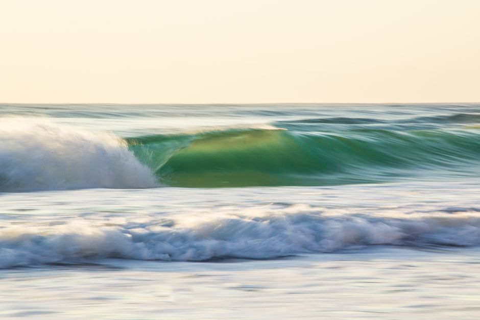
Water is not blue. It is whatever is above it, darkened and broken up. A sea under a warm sky is full of pinks and golds. A sea under cloud is gray-green with almost no blue in it at all. On a numbered canvas this shows up as a run of eight or ten colors that all look nearly identical in the pot, and telling them apart under a lamp at nine in the evening is the actual difficulty.
The shapes are small and irregular. Foam, chop and reflected light break a surface into hundreds of little sections. There is no large restful area in a stretch of moving water the way there is in a field or a sky.
The horizon is unforgiving. A horizon line that is even slightly off level is instantly visible, because everyone knows what level water looks like. This is one place a numbered canvas gives you a real advantage over freehand painting: the line is printed, and if you paint carefully up to it, it will be straight.
Which Ocean Designs Are Friendly
Look at the picture, not the description. Three things tell you most of what you need to know.
How much of it is sky. A scene where the sky takes up a third or more of the canvas has a large calm area built into it. That is an evening of easy progress and it matters more than people expect.
Whether the water is calm or breaking. Flat water at dusk, a still bay, a lake surface: large shapes, few colors, restful. Breaking surf with spray and wet rock: hundreds of small sections in a narrow range of whites, grays and greens. Both are good paintings. Only one is a good first canvas.
How much is in shadow. Night and storm scenes give you very little visible progress for hours, and the printed numbers are hardest to read exactly where the paint is darkest. A daylight or sunset scene is kinder.
Sunset scenes carry their own catch worth knowing about. They look simple because they are mostly sky, but that sky is often a dozen oranges, pinks and violets separated by small differences. Have the reference print beside you and check the number twice before you commit a section.
The Order to Paint a Seascape
Water rewards a specific working order more than most subjects.
- The whole sky first. It is the largest single area and it sets the value of everything below it. Finishing it in one sitting also gets you past the stage where a canvas looks like nothing.
- Distant water next, working forward. The band nearest the horizon is usually the flattest and lightest. Coming toward the viewer, the shapes get larger and the colors get stronger.
- Dark to light throughout. Lay in the deep troughs and shadowed water before the lit surfaces. Light acrylic covers dark acrylic far better than the reverse, so this order saves you second coats.
- Foam and highlights last. The whites are the final pass, sitting on top of everything else. Painted first, they get muddied by every color that follows.
- Expect two coats on the pale colors. Whites and creams over a printed number rarely cover in one pass. That is normal.
One more habit worth adopting on a seascape: stop for the night at a color change rather than in the middle of a band of water. Water sections repeat, and coming back tomorrow unsure which number you were on is a genuine annoyance.
Sand, Rocks and Wet Surfaces
Wet sand and wet rock are the same problem as water, one step simpler. They reflect the sky, so they are lighter and cooler than dry sand and dry rock, and the boundary between wet and dry is usually the brightest line in the lower half of the painting. On a numbered canvas that is a color you will use once and put away, so do not lose the pot.
The Water Scenes We Make
Our catalog is licensed original artwork, and several of the designs are coastal or lakeside: Seaside Escape by Darrell Bush, Seaside Paradise by Abraham Hunter, and Moonlight Bay, Guiding Light and Still Waters by Kim Norlien.
Being honest about them is more useful than selling them evenly. Seaside Paradise is one of the more demanding kits in our range, and our own customers say so in the reviews. The calmer water scenes are a much gentler place to start. We would rather you finished a canvas than admired a harder one for a fortnight and put it away.
Every kit ships rolled in a tube rather than folded, with vacuum-sealed paints, brushes in a range of sizes and an 11 by 17 inch reference print, which matters more on a water scene than on almost any other subject. Sizes are 12x16 and 16x20 framed, and 16x20 unframed. The full catalog is here.
Or Paint Your Own Coast
If the water you actually want on the wall is a particular beach, we turn photographs into numbered kits, printed in the USA, in 12x16, 16x20 and 18x24 inches.
A few notes for coastal photos specifically. Shoot toward the light late in the day rather than at midday, when the sea goes flat and colorless. Include something with a recognizable edge, a headland or a jetty or a boat, so the eye has somewhere to land. And keep the frame simple, because a wide empty seascape reduces to a lot of very similar numbered bands. You can start one on the custom paint by numbers page.
The beginner's guide covers the general working order, and the customer gallery shows finished canvases sent in by the people who painted them.


