


Nature is the easiest subject to paint badly and the most satisfying to paint well. Easy to paint badly because foliage, water and sky forgive almost any brushmark, so nothing stops you. Satisfying when it works because the moment the distance separates from the foreground, the whole thing comes alive at once.
The one rule that makes a landscape read
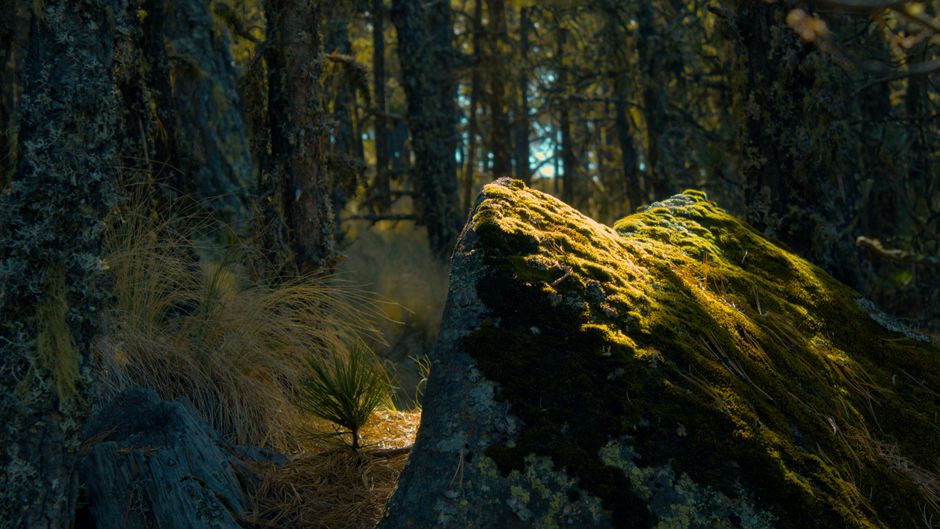
Air between you and an object scatters light. So the further away something is, the lighter it gets, the cooler and bluer it gets, and the less contrast it holds.
That is the whole of it. A distant ridge is a pale, flat, blue-gray shape with barely any variation in it. The tree twenty feet away has strong darks, warm greens and a crisp edge. Painters who cannot make depth work are almost always painting the far things as vividly as the near ones.
The practical version, in order of usefulness: keep the distance flat and thin, save texture and thick paint for the foreground, and keep far edges softer than near ones.
Greens, which is where most nature paintings fail
One green from a tube across a whole landscape produces something that reads as wallpaper. Real foliage is a range: yellow-green in the sunlight, blue-green in shadow, and gray-green in the distance.
Mix them from a yellow and a blue rather than pouring them. More yellow for the lit passages, more blue for shadow, and a touch of red to knock the saturation out of anything meant to sit back. Red works because it sits opposite green on the color wheel, so it desaturates without turning the color to mud the way black does.
Water, sky and snow
Water is a mirror with the color of the sky in it, not a blue thing. Reflections run vertically down from the object above them, break into horizontal marks where the surface moves, and are always slightly darker and less contrasted than the thing they reflect.
Sky is not one color. It is lighter and warmer near the horizon and deeper overhead, and getting that gradient in is most of what makes a sky look like air rather than paint.
Snow is not white. Sunlit snow is a warm off-white, and snow in shadow is genuinely blue. A snowfield in a single flat white has no form in it at all.
The nature designs we make
Most of our catalog is the natural world in one form or another. Four worth knowing about:
Away From it All is a small rocky pine island on flat, calm water. Large areas, a lot of sky and reflection, and one of the gentlest designs to work through.
Northwoods Retreat is a moose at a lake among birches, built on strong blues and greens, with a cabin behind. Wildlife as the subject rather than the decoration.
Rocky Mountain Campsite puts a canoe at a mountain lake with snowcapped peaks and autumn color. Guiding Light is a clifftop lighthouse with an eagle in flight over the sea. The bird and animal designs — hummingbirds, bluebirds, geese, wolves, songbirds — are gathered in the animals collection.
Where paint actually comes from
Worth knowing, because it explains why certain colors feel like landscape colors.
The earth pigments — yellow ochre, raw and burnt sienna, raw and burnt umber, terre verte — are literally ground earth, colored by iron oxides and clays. They are among the oldest pigments in use anywhere, they are extremely stable, and they are the backbone of nearly every landscape palette. Sienna and umber are named after the places their earth was originally dug.
The binders were natural too. Egg tempera used egg yolk and dominated European panel painting before oil took over. Milk paint used casein, the protein in milk, and gives a chalky matte surface that is still made today.
Modern acrylic swaps the binder for a synthetic polymer and keeps many of the same mineral pigments. When you paint a hillside with burnt sienna, you are using more or less the same colored earth people were using thousands of years ago.
Order of work
Sky first, then the furthest land, then work forward. Top to bottom, so your hand never rests on wet paint. Finish the whole background before touching the foreground, so that a foreground edge is painted over a dry surface rather than dragged into a wet one.
Skies and water are large areas and use paint faster than fine detail does, which is worth planning for rather than discovering. The rest of the catalog is in one collection, and it is worth browsing by the artwork rather than the names.


