


An autumn bridge is one of the most-searched subjects in paint by numbers, and it is easy to see why. A bridge gives a picture a spine, the water underneath doubles the color, and autumn hands you a palette that needs no arranging.
It is also harder to paint well than almost any other landscape, for a reason worth understanding before you buy one.
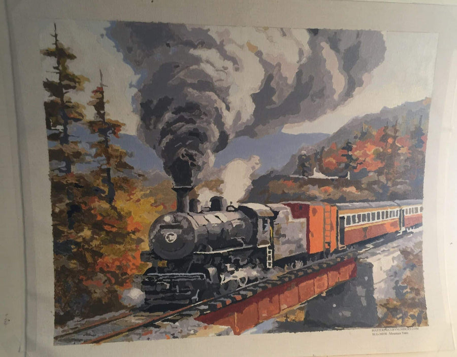
Why autumn is difficult on a numbered canvas
The pleasure of autumn is that everything is warm: ochre, rust, amber, brick, gold, russet. The problem is exactly the same thing. A design like this will hand you eight or ten pots that are all recognizably orange, and telling number 14 from number 17 an hour apart is genuinely hard. The Thanksgiving palette has the same problem, for the same reason.
Compare that with a winter or a marine scene, where the palette runs from near-white to near-black through blues and greens, and every pot is obviously itself.
There is one habit that solves most of it. Work one number all the way across the canvas before you open the next pot. Related warm colors separate clearly when they are laid side by side in a single session, and they do not separate at all when you are matching from memory. It is the same reason a row of paint chips is easy to sort and a single chip is impossible to identify.
If you would like to understand why those colors are so hard to tell apart in the first place, our guide to the basic color wheel covers how neighboring hues behave.
The bridge itself
Two things carry a bridge, and both are structural rather than decorative.
The arch has to sit level. Our eyes are unforgiving about this in a way they are not about a tree. Paint the bridge before the foliage that overhangs it, so you can see the whole span at once and judge the curve, rather than reconstructing it around leaves you have already put in.
The underside is darker than you think. The shadowed face beneath an arch is usually the darkest value in the whole picture, and that darkness is what makes the bridge read as solid. Resist the temptation to lighten it.
For a stone bridge, the individual stones are usually only two or three numbered tones repeated in an irregular pattern. Do not try to make them look random by varying them yourself; the design has already handled it.
The water underneath
Autumn reflections are the payoff for the whole picture. Three things to remember:
- Horizontal strokes. Whatever direction the shapes run, move the brush across rather than up and down. Water lies flat.
- Reflections pull toward the middle. A bright leaf reflects darker than it is; a dark bridge reflects lighter. This looks wrong on the palette and correct on the canvas.
- Let each band dry before laying the next beside it. Warm colors dragged wet into wet go brown almost instantly, and brown is exactly what you were trying to avoid.
What we actually make
We would rather tell you this plainly than sell you something we do not have. There is no autumn bridge design in our range at the moment. What there is:
Two designs with a bridge
Mountain Village is a humpbacked stone bridge at the center of a village at dusk, with lamplight in the cottage windows, a church spire, ducks on the water below and roses over the wall in front. It is the warmest-lit piece we sell and it is not a beginner's kit: a dozen roofs, a spire and a bridge full of individual stones. Budget nearer twenty-five hours than fifteen.
Beautiful Sunset in Amsterdam has a low stone bridge over a canal, gabled houses in brick and burnt orange, bicycles against the railings and a barrow of tulips. It is the most colorful thing in the range and, like Mountain Village, it is architecture, so it is windows and railings rather than open fields.
One design with real autumn color
Away From it All is a log cabin above a lake with birch and aspen fully turned to gold, a stream over mossy granite and two ducks in the shallows. It is one of the more forgiving kits we make: the sky, the water and the rock face all go in as large areas, and the foliage is where the small work is.
If it is a particular bridge you have in mind
Most people searching for this have somewhere specific in the back of their mind: a covered bridge on a road they know, a park in October, a stone crossing they walked over as a child.
what to know about bridge paint by numbers is the honest version of that search, including why almost nobody legitimate sells the design you are picturing.
That is a better painting than any generic one, and you can have it directly. A custom canvas made from your own photograph comes in 12x16, 16x20 and 18x24, framed or unframed, and it is printed here in the United States.
One piece of advice specific to this subject. Photograph it on an overcast day rather than in full sun. Autumn foliage in flat light separates into distinct masses of color, which is exactly what a numbered canvas needs; in harsh sunlight it fragments into a thousand highlights that will come back to you as a thousand tiny regions.
A note on where these kits came from
Paint by number as we know it began at the Palmer Paint Company in Detroit in 1949, where the owner Max Klein set the brief, Dan Robbins designed the first sets, and the kits went on sale in 1951. Landscapes were the mainstay from the start, for the same reason they still are: they forgive an unsteady hand, and people want to look at them. We have written the fuller story in the history of paint by numbers.


