


Clouds are the most attempted and least successfully painted thing in landscape painting. Almost everyone paints them the same wrong way, and the fix is one change of order.
A brief word on the calming part first, since that is often why people start with skies.
On the therapeutic side, honestly
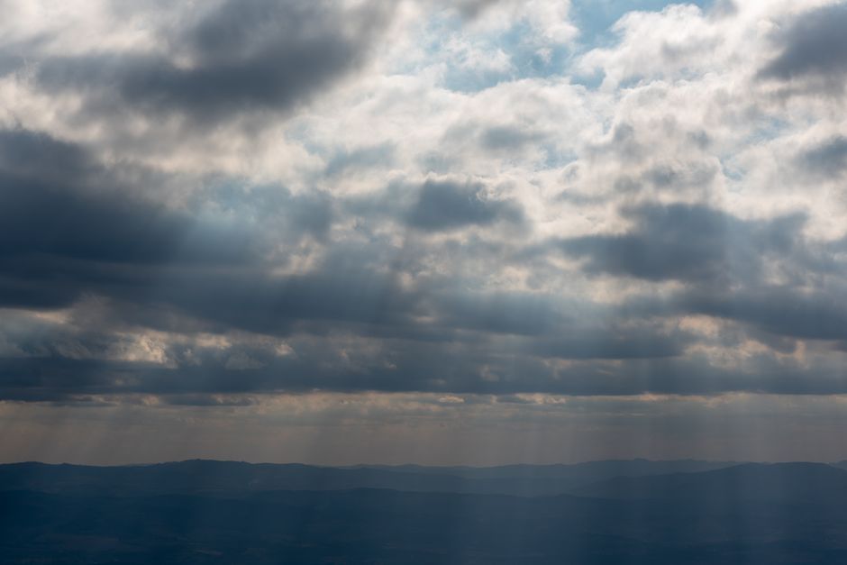
Painting a sky is absorbing, repetitive and low-stakes, and most people find that combination calming. Watching clouds is much the same. That is worth having and it is a good enough reason on its own.
What we will not tell you is that it triggers happy hormones or releases endorphins, which is the kind of thing these articles usually claim and which nobody has established. There is genuine research on art therapy as a clinical practice, and it points toward reduced anxiety, but the researchers themselves rate the evidence as low quality and art therapy with a trained therapist is not the same as a hobby at your kitchen table. Painting a sky is a good evening. It is not a treatment.
What a cloud actually looks like
Here is the thing that changes everything, and almost every beginner paints the opposite.
A cloud is not a white shape. It is a solid object with a lit side and a shadowed side. The top catches the sun and is very light. The underside is in its own shadow and is considerably darker, often a soft gray-violet. It has volume, exactly like an apple or a boulder.
Paint white blobs on blue and you get cotton wool. Paint a lit top and a shadowed base and you get a cloud.
The order to work in
1. Sky first, all the way across
Paint the whole sky before any cloud, including behind where the clouds will go. It is much easier to lay clouds on top of a finished sky than to cut a sky in around them.
Make it graded rather than flat. A clear sky is deepest and coolest overhead and gets paler, warmer and slightly hazier as it approaches the horizon, because you are looking through more atmosphere. Mix your deepest blue for the top, then add white and a touch of warmth as you work down. A sky painted one flat blue is the second most common reason a landscape looks amateur.
2. Block the cloud mass in gray, not white
This is the step everyone skips. Mix a mid-tone gray with a violet leaning, using your blue, a little of its complement and white, and paint the entire cloud shape in it. Soft-edged, no outline.
You now have a shape that already reads as an object. Everything after this is adding light to it.
3. Lit tops
Mix an off-white by adding the smallest touch of yellow or pink to white, since sunlit cloud is warm rather than pure. Apply it only on the surfaces facing the light: the tops and the shoulders of the billows.
Decide where the sun is before you start and keep it there. Every cloud in the picture must be lit from the same side.
4. Deepen the shadowed base
The underside is darker and cooler. Deepen the gray you blocked in with more blue and a little violet.
Never reach for black. A cloud shadow is full of reflected light bouncing up from the ground and around from the sky, so it stays colorful. Black gives you a dirty hole where the cloud should be.
5. Save the brightest white for last, and for very little
Pure titanium white, straight from the tube, goes on one small area: the very brightest edge nearest the sun. If you use pure white across the whole cloud you have nothing left in reserve, and the cloud flattens out.
The rule is general: keep your lightest light for the smallest area.
Edges are the whole craft
A cloud has three kinds of edge in the same picture, and varying them is what makes it look like vapor rather than a cutout.
- Crisp along the top edge where it is lit and dense against the sky.
- Soft around the billowing sides, blended into the blue while both are wet.
- Lost at the base, where the cloud dissolves and you cannot say where it ends.
Hard edges the whole way round is the signature of a beginner sky.
Clouds have perspective too
Rarely mentioned and immediately convincing once you use it. The clouds above you are large, well separated and you can see their undersides. As they recede toward the horizon they appear smaller, flatter, closer together, and their contrast drops away.
Painting evenly sized clouds evenly spaced across the canvas is what makes a sky look like wallpaper.
Brushes and the acrylic problem
A soft round or a filbert does the mass. A fan brush, used almost dry, gives you the wispy trailing edges. A stiff brush with very little paint on it, dragged lightly, catches the canvas weave and makes good broken texture.
Do not use a flat brush for crisp cloud edges. Clouds do not have straight edges anywhere.
The real difficulty with acrylic here is that soft edges need wet paint and acrylic gives you about a minute. Three ways around it: work small areas fast, wet-on-wet; add a retarder medium to extend the open time; or build the transition in several thin, semi-transparent layers once each is dry, which is slower but very controllable.
Watercolor is genuinely the easiest medium for soft cloud edges, since the paper does the blending. One correction to a claim you will see often, though: watercolor is not easy to correct. It stays soluble and lifting a passage usually disturbs it. The lights in watercolor have to be planned from the start.
The five mistakes
- White blobs on blue. No shadow, no volume.
- Outlining. A drawn line around a cloud kills it instantly.
- A flat sky. No gradient from zenith to horizon.
- Black in the shadows. Muddy and lifeless.
- Uniform clouds, evenly spaced. Vary the size, and let them overlap.
If you would rather not mix any of it
Skies are where a numbered canvas quietly does something clever: the gradient in the sky and the lit and shadowed parts of the clouds are already separated into numbered bands, so you get the effect without mixing a thing. Fill the bands, stand back, and it reads as a smooth gradient.
Several of our designs are worth studying for exactly this. Be Still is a sunset over water in bands of gold, rose and violet. Rural Route Bluebirds is more than half soft cloudy sky. Mountain Paradise has late sun catching cloud above a mountain.
The full range is in our collection, and we can turn one of your own photographs into a numbered canvas. If you are mixing your own colors, the color wheel is where the gray-violet shadow mix comes from.


