


A numbered canvas is a set of instructions, not a contract. Plenty of painters follow it exactly and are perfectly happy, and plenty depart from it. Both are fine.
What follows is the useful version of this advice: which changes work, which quietly ruin a painting, and the one rule that governs all of it.
The One Rule: Match the Value, Not the Color
This is the whole thing, and almost nobody says it.
The numbering on a kit is really a map of light and dark. What makes the finished image read as a tree or a face or a wave is not the specific greens and browns. It is that some sections are darker than the ones next to them, in exactly the right places. Color sits on top of that structure.
So you can swap a color freely as long as you replace it with something of the same lightness. Change a mid-green for a mid-blue and the painting still reads. Change that same mid-green for a pale cream and the shape it was describing collapses, because the difference between it and its neighbor has gone.
The quick test: squint hard at your reference print until the detail disappears and you see only light and dark patches. Whatever you substitute has to occupy the same patch of that squinted image. If you can hold that one idea, you can repaint an entire kit in a different palette and it will still work.
Changing the Palette
Some approaches that hold up in practice:
- Shift the whole thing warmer or cooler. Nudge every color a step toward orange, or a step toward blue. Because you are moving everything together, the value relationships survive intact. This is the safest large change you can make and it will match a room.
- Change one thing and leave everything else. A red barn instead of a white one, a different color on a boat hull. Small, contained, low risk.
- Reduce the saturation. Adding a touch of the painting's darkest brown into every color mutes the whole canvas without disturbing the values. It is an easy way to take a bright design down to something more restrained.
What does not work is picking colors one at a time because you like them individually. That is how a canvas ends up looking busy and flat at the same time. Our guide to the color wheel covers why certain pairs fight each other.
Adding Texture
Texture is the easiest genuine improvement to make, because it changes how the surface catches light without touching the design at all.
Work thicker on the lights. Leave the shadows thin and flat, and load the brush more heavily on the brightest passages. Real paintings almost always do this, and it is why they look alive in raking light. It costs nothing but a little extra paint.
Use a dry brush on foliage and water. Wipe most of the paint off, then drag the brush lightly across a dried section. It catches on the weave and leaves a broken, textured mark that reads as leaves or glitter on water.
Try a palette knife on the largest areas. Skies and fields take a knife well. Go over a dried section with a small amount of the same color pushed on with the edge of a knife, and you get ridges that a brush cannot make.
Do all of this over dry paint, not wet. Acrylic sets in minutes, and trying to work texture into a section that is halfway dry lifts the coat underneath.
Changing the Background
Backgrounds are the most forgiving place to depart from the numbers, because they carry the least detail.
A graded sky is the usual choice: darker at the top, lighter toward the horizon. To do it with acrylic you have to work fast, because you only get a minute or two of open time. Lay both colors on where they meet and work the join immediately with a clean, slightly damp brush. If it dries before you get there, put a third color between them instead and blend that. Nobody will know.
Whatever you do to a background, keep it darker than the subject in front of it, or the subject stops standing forward.
Signing It
The most personal touch available, and the most commonly skipped.
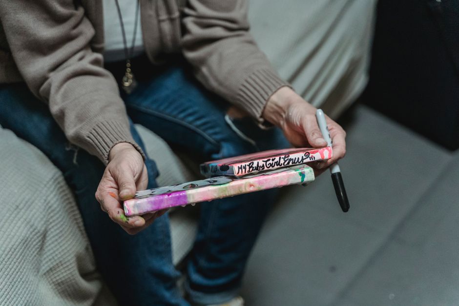
Sign the front in the lower corner with the finest brush in the kit, in a color already used elsewhere in the painting so it sits in rather than jumping out. Small is better than large. Then write the date, and the occasion if there was one, on the back in pencil or pen. Twenty years from now that is the part that will matter, particularly if the painting ends up with someone else in the family.
A date and a name on the reverse is what turns a kit into a record of a particular winter.
What to Leave Alone
- Stickers, decals and glitter. They sit on top of the paint rather than in it, and they lift and yellow long before the acrylic does. If you want an extra element, paint it.
- Blending across section boundaries while wet. It sounds appealing and it is how most people put a gray haze across a canvas. Acrylic will not do a long soft blend. Work the join fast or leave the edge.
- Priming or sanding the canvas. A coat of gesso covers the outlines and numbers permanently. The canvas arrives ready to paint on.
- The order of work. Dark to light, background to foreground, regardless of what else you change. Light acrylic covers dark acrylic far more easily than the reverse, and that does not stop being true because you have altered the palette.
Finishing
Let the paint cure for a couple of weeks, then a single thin coat of varnish will protect the surface and even out the patchy sheen where some colors dry matte and others glossy. One thin coat, not one thick one.
Then frame it in a way that suits the painting rather than the room. Our guide to framing a finished canvas covers the options, and layering acrylic paint goes deeper into building up coats.
If you want the whole image to be yours rather than the palette, a custom kit made from your own photograph is the other route. The catalog is here, and the customer gallery shows what other people have done, including several who clearly did not stick to the numbers.


