


Lighting does more for a difficult canvas than any brush, lamp position more than lamp price. If the fine sections feel like a strain, the light is nearly always the reason, and it is the cheapest thing on the table to fix.
Why daylight on its own does not work
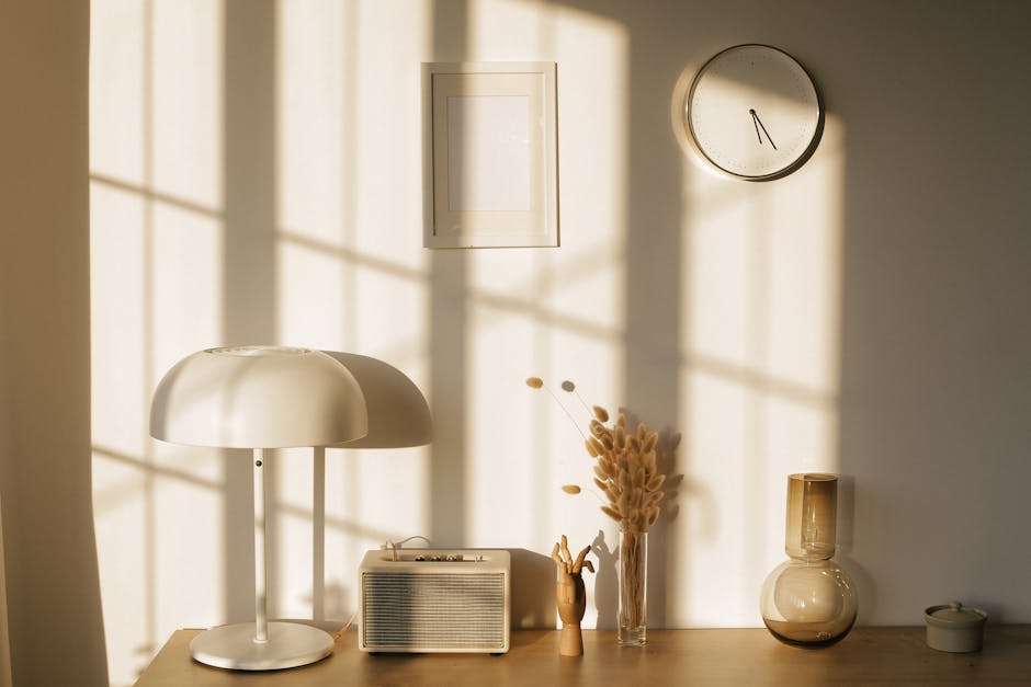
North-facing daylight is the classic studio light for a good reason: it is even and it barely changes through the day. Almost nobody has it.
What most people have is a window that swings from cool and blue in the morning to warm and gold in the late afternoon, and disappears entirely in the evening, which is when most people actually paint. Colors matched under one of those conditions will not match under another. If you want the painting to look right in the room it will hang in, you need a consistent light source you control.
The two numbers that matter
Color temperature, in kelvin. This is how warm or cool the light is. Around 2700K is the warm yellow of a domestic bulb, 4000K is neutral, and 5000K to 6500K approximates daylight. For judging color, aim for 5000K to 5500K. A warm bulb makes yellows and reds look richer than they are and pushes blues gray, which means the painting looks different the moment it leaves the room.
CRI, the color rendering index. This is how faithfully a light shows colors compared with natural light, scored out of 100. It is the more important of the two and the one that is usually left off the box. Look for CRI 90 or above. A cheap bulb at CRI 70 can make two genuinely different paints look identical, which is a real problem when a kit hands you four near-identical greens and expects you to tell them apart.
Both numbers are printed on decent LED packaging. If neither is stated, assume neither is good.
Which type of lamp
LED, for most people. Efficient, cool to the touch, dimmable, and available at high CRI. There is no meaningful downside now.
Incandescent and halogen render color beautifully but run hot, which matters when the lamp is close to your hands and to a canvas for hours. Ordinary fluorescent tubes are the ones to avoid: low CRI and a spectrum with gaps in it that distorts particular colors unpredictably.
Where to put it
This is the part that costs nothing and changes the most.
- On the opposite side to your painting hand. Right-handed, light from the left. Otherwise your own hand casts a shadow across the exact section you are working on.
- Above and slightly forward, around 45 degrees. High enough to clear your head, forward enough that the canvas is lit rather than the table.
- Never straight on. Light square to the canvas bounces straight back off wet acrylic and produces a sheen that hides the section under it. Angling the lamp puts that reflection somewhere other than your eyes.
- Add ambient light as well as the task lamp. A bright pool in a dark room forces your eyes to keep adjusting between the canvas and everything else, which is what actually causes the fatigue people blame on close work.
Two additions worth having
A magnifier lamp — a lens with a light ring around it, on an arm — is the single best purchase for anyone who finds the finest sections hard to see. Plenty of people with entirely normal vision use one, and printed guide numbers on a detailed canvas are small.
A clamp arm matters more than the lamp itself. A lamp you can reposition in two seconds gets adjusted constantly; one that sits on a heavy base in a fixed spot does not, and you end up working around it.
Checking your setup in ten seconds
Sit as you normally would and hold your brush against the canvas. If there is a shadow on the section under the tip, the lamp is on the wrong side. Then tilt your head slightly and look for a bright sheen on the wet paint. If you can see one, angle the lamp further to the side.
Get those two right and a design described as demanding becomes noticeably less so. The other lever, if you need it, is size: the same artwork at 16x20 has physically larger sections than at 12x16, which our catalog offers on every design.
The rest of the setup — the canvas angle, the two water jars, the brush that suits the fine work — is covered in the beginner guide and in our notes on choosing brushes. And if you are trying to judge whether two colors are genuinely different or your light is lying to you, the color wheel is a useful sanity check. Finished work photographed in ordinary rooms, under ordinary lighting, is in the customer gallery.


