


Woodland canvases go wrong in one particular way, and it is always the same way. You open the kit, you find eight pots of green that look almost identical, and by the time you are halfway through you have used the wrong one somewhere and the whole scene has gone flat.
Everything below is about preventing that, and it starts before you pick up a brush.
Why all those greens exist
A forest is not one color repeated. It is the same color changed by distance, and distance does three things to green at once. It makes it lighter, it makes it cooler, meaning bluer, and it makes it less saturated, meaning grayer. The far trees on a hillside are pale blue-green. The branch three feet in front of you is dark, warm and vivid.
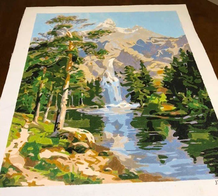
That is the whole reason a woodland kit ships with so many greens, and it is why the pale ones look weak and washed out in the pot. They are supposed to. Painted into the distance they read as depth. The single most common self-inflicted problem is deciding the pale green looks wrong and reaching for something stronger.
The same effect governs everything on the canvas, not just green. The color wheel covers the warm-forward, cool-back principle in a few minutes and it is worth the read before a forest scene. What a forest design asks of you is mostly patience with close greens.
Lay the greens out by value, not by number
Before you start, take the green pots out and arrange them in a row from lightest to darkest, ignoring what number is on them. Do the same with the browns.
This takes two minutes and it does something quite specific. Once the pots are in visual order, picking up the wrong one becomes something you can see rather than something you discover an hour later. Numbers in numerical order tell you nothing about which greens are neighbors.
Work from the back forward
Sky first, then the far treeline, then the mid-ground, then whatever is closest to you. Two reasons. Your hand rests on finished, dry paint rather than on wet, and you build the scene in the order the eye reads it, so you can tell early whether the depth is holding.
Within that, keep working one number at a time across the whole canvas rather than finishing one tree at a time. Fewer rinses, fewer misreads.
The three parts that need a different touch
Foliage masses
Paint the shape as drawn. Do not try to make a region look like leaves, because it is not a leaf, it is a clump of leaves seen from across a clearing. Filled flatly and cleanly it will read correctly at viewing distance. Fussing at it with small strokes makes it look like scribble.
Trunks and branches
Pull the brush vertically, along the length of the trunk, not across it. Birch trunks are the exception worth noting, because the dark markings run horizontally across a pale bark and are usually the last thing to go on.
The thinnest twigs are the narrowest regions on the canvas. Leave them until everything around them has dried, use the narrow edge of a flat brush, and pull each one in a single stroke. A twig painted in two strokes with a join in the middle looks like a twig painted in two strokes.
Water and snow
Most woodland designs have a lake or snow in them, and both work the same way: a reflection or a shadow is always darker and less saturated than the thing casting it. If a shadow color on snow looks oddly blue, that is correct. Snow in shadow is genuinely blue, because it is lit by the sky rather than by the sun.
Which of our woodland designs to start with
Away From it All is the gentlest of them. A quiet lake, a rocky island with a stand of pines, a cabin at the shore. Large calm areas of water and sky, a clear front-to-back structure, and not much fine detail to lose your place in. Our customers consistently rate it as a good first kit.
Northwoods Retreat is the next step up. A moose standing at the water's edge among birch trunks, with a strong blue lake behind. The birches give you good practice at the vertical-stroke discipline, and the color separation between water, trunks and foliage is wide enough to be forgiving.
Enchanted Woods is the one to be honest about. It is a snowy log cabin with chickadees among snow-laden branches, and it looks like the obvious woodland choice. It is one of the more demanding designs we sell. The snow on the branches breaks the canvas into a great many small pale regions that differ from each other only slightly, and the birds are small. It is a lovely canvas and it is not a first one.
The rest sit together in the cabin and woodland designs, which run from summer lakes to deep winter.
One thing not to do
You will find advice online suggesting you iron the back of a paint by numbers canvas to remove creases before starting. Ours are rolled in a tube rather than folded, so there should be nothing to remove, and heat on a printed canvas risks the print and the primer. If a canvas ever arrives with a crease, lay it flat under a few books overnight instead.


