


Lighthouses have been a staple of landscape painting for two hundred years, and it is not sentiment that keeps them there. It is composition.
A coastline is almost entirely horizontal: the horizon, the shoreline, the bands of surf. Drop a tall white vertical into the middle of that and you have a picture. The eye has somewhere to go, the horizontals have something to measure themselves against, and the whole arrangement resolves. Painters worked this out early and have not stopped since. The lighthouse designs we carry lean on exactly that arrangement.
What makes a lighthouse difficult
The tower has to stand up straight
This is the mistake that ruins more lighthouse paintings than any other, and it is unforgiving because everybody can see it. We tolerate a badly drawn tree without noticing. A tower leaning two degrees off vertical is obvious to anyone in the room.
Two habits fix it. Check the tower against the edge of your canvas, which is a true vertical, rather than against the sea. And make sure the horizon behind it is genuinely level, because a sloping horizon will make a perfectly upright tower look like it is falling over.
Most lighthouses are tapered, not straight-sided
The classic tower is wider at the base and narrows toward the lantern room. Painted with parallel sides it reads as a chimney. The taper is usually subtle, so the thing to do is establish the width at the bottom and the width at the top before you paint either side.
The light is not the whitest thing you can paint
The most common way of painting a light is to load the brush with white and put a blob where the lamp is. It never works, because a light does not look bright by being pale. It looks bright by being surrounded by something dark.
If the tower is white and the sky is pale, there is nothing left to make the lamp glow with. Darken the sky immediately around the lantern room and the light appears without you touching it. This is the same principle as everywhere else in painting: contrast makes light, not white paint.
The rocks are simpler than they look
Wet rock at the base of a tower looks impossibly complicated and is usually three or four values in irregular patches: a lit top plane, a shadowed side, a wet dark at the waterline, and a few reflected lights. Establish those as flat shapes first and resist adding detail until they read correctly from across the room.
A note on the real ones
Part of the appeal is that these are working structures with dates attached. Boston Light, on Little Brewster Island, was the first lighthouse built in what became the United States, established in 1716 and rebuilt in 1783 after being destroyed during the Revolutionary War. Portland Head Light, on Cape Elizabeth in Maine, was completed in 1791 and is one of the most painted and photographed structures in the country.
Maine in particular drew painters for a century. Winslow Homer worked that coast for the last decades of his life, and Edward Hopper painted the lighthouses at Cape Elizabeth in the late 1920s. Between them they established the two ways of treating the subject that are still the two ways: Homer's, where the sea is the drama and the light is a fixed point in it, and Hopper's, where the building is a solitary geometric object in strong sun.
Painting one as a numbered canvas
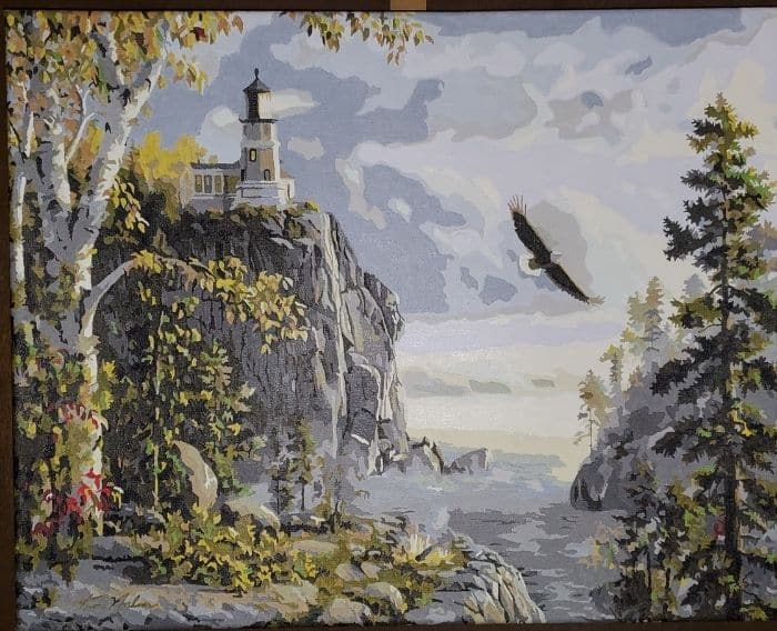
Guiding Light is Kim Norlien's painting of a lighthouse on a sheer rock headland above a great lake, with a bald eagle turning on the air off the cliff, a white birch already into its autumn color, and a small campfire on the rocks at the waterline. Coastal Americana overlaps heavily with the patriotic designs, which draw on the same palette.
It is a good middle-of-the-road kit and a common first choice. Customers single it out for clear lines and numbers that are easy to read. The cloud bank and the open water are broad and forgiving; the tower railings and the eagle are the fine work. The eagle is small but simply built, only a handful of numbered shapes, and it is far easier if you leave it until the sky around it is finished and dry.
Ten to twenty hours on the 16x20, like most of our range.
If it is a particular lighthouse
Most people who search for this have one in mind, usually somewhere they have been. A photograph of it can be turned into a numbered canvas directly, through our custom kits made from your own photo, in 12x16, 16x20 or 18x24, framed or unframed.
Two things to watch when you choose the photograph. Take it or pick one where the tower is clearly separated from the sky rather than lost against a bright overcast, because a numbered canvas needs contrast between regions to have anything to work with. And avoid a shot taken from directly below: the foreshortening that looks dramatic in a photograph reads as a mistake in a painting.
For the water underneath, our piece on painting the sea on a numbered canvas covers surf and reflections. If you would rather paint one freehand, easy things to paint with acrylic starts with the sky and the water that go behind it. The rest of our designs are in the full collection.


