


Mountains are the most forgiving landscape subject and the easiest one to flatten. Forgiving, because rock and snow tolerate an imprecise edge in a way that a face or a bicycle does not. Easy to flatten, because if the distant peaks are painted as strongly as the near ones, the whole picture collapses onto a single plane.
Here are the mountain designs we make, what is actually in each one, and how to keep the distance in them.
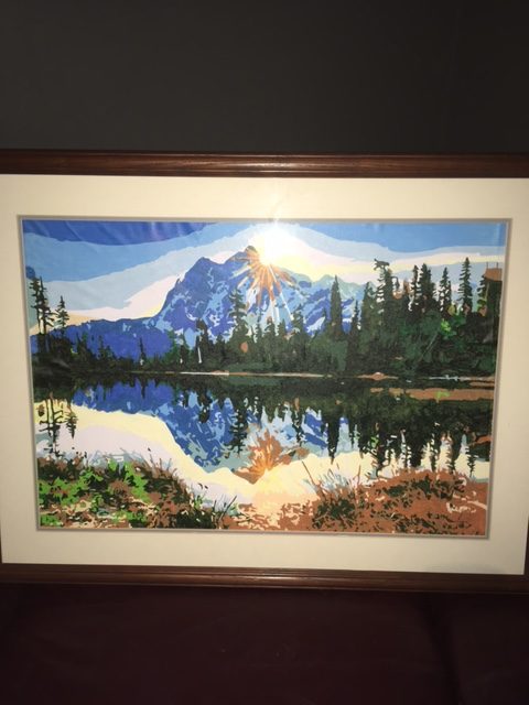
The designs
Rocky Mountain Campsite is a canoe drawn up at a mountain lake with snowcapped peaks behind and autumn color on the near shore. It is the most straightforward of the group: large open water, big sky, and a clear separation between foreground and distance. A reasonable choice for a first landscape.
Mountain Paradise puts a cottage and a waterfall in front of the peaks, with autumn trees around it. More going on than the campsite, and the moving water is the section that needs the most care. Water in motion is its own problem, and painting falling water is worth reading before you start one.
Mountain Village is the demanding one. A village with a church spire, a stone bridge and a stream running under it, with peaks behind. Architecture means straight lines that have to stay straight, and the water underneath has to hold a reflection. Beautiful, and not a first canvas.
Moonrise Song is wolves in snowy forest with mountains and a night sky behind them. The challenge here is not the mountains at all — it is the number of near-white values in the snow, which are easy to lose track of.
Aurora Bliss and Life's Reward both use mountains as a backdrop rather than a subject: a snowy cabin at night in the first, a cabin and lake with a campfire in the second. If you like the setting more than the peaks, those are the gentler way into it.
Painting distance so it reads
Everything that makes a mountain look far away comes down to one effect. Air between you and an object scatters light, so the further away something is, the lighter it gets, the cooler and bluer it gets, and the less contrast it holds.
On a numbered canvas the artist has already built this in, and your job is not to undo it. Three ways people accidentally do:
- Painting the far peaks too thickly. A heavy, textured application of paint reads as close, whatever the color is. Keep the distant sections flat and thin; save any texture for the foreground.
- Sharpening the far edges. The boundary between a distant peak and the sky should be softer than the boundary between a foreground rock and the grass. If you are going to blend anything on the canvas, blend there.
- Making the darks too dark up high. Shadow on a far ridge is a pale blue-gray, not a deep gray. It looks wrong on the palette and correct on the canvas.
Snow is not white
The single most useful thing to know about painting mountains. Sunlit snow is a warm off-white; snow in shadow is blue, sometimes strongly so. A snowfield painted in one flat white has no form in it at all. Numbered designs handle this by giving you three or four near-white pots that look almost identical in the tray — resist the urge to treat them as the same color, because those small differences are doing all the modeling.
Two thin coats work better than one thick one on the light sections, since pale colors are the least opaque and the printed number tends to show through a single pass. Let the first dry properly, which is covered in our guide to layering acrylic paint.
Order of work
Start at the top and work down, so your hand never rests on wet paint. Do the sky first, then the furthest peaks, then work forward. Finishing the whole background before you touch the foreground also means that if a foreground edge strays, you are covering a dry surface rather than dragging wet paint into it.
Skies and snowfields are large areas and use paint faster than the small detail sections do, so an extra paint set is worth having on hand for this subject in particular.
The rest of the landscape designs, mountains and otherwise, are in one collection. Worth browsing by the artwork rather than the names — several of the titles do not describe what the picture actually shows.


