


One design in our catalog has a waterfall in it. Mountain Paradise puts a log cabin beside a still pond with a fall coming down through the rocks on the left, a snow-topped peak behind, autumn trees turning, and geese on the water.
It is worth knowing what you are taking on, because falling water is one of the few subjects that regularly defeats people on an otherwise straightforward canvas, and it defeats them in the same way every time.
Why waterfalls are hard
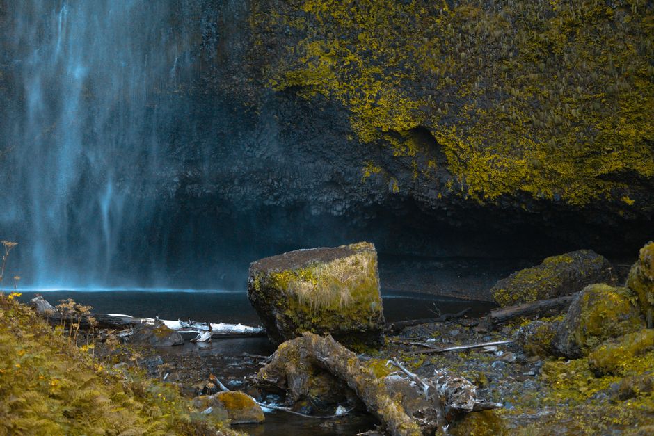
Everything else in a landscape holds still. A tree has a shape, a rock has a shape, and the painting is a record of what was there. Falling water has no shape at all. Any picture of it is a frozen instant of something that was never in that arrangement before and never will be again, which means there is no correct version for the eye to check against, only a version that is convincing or not.
On a numbered canvas this becomes a specific practical problem. The fall arrives as a column of pale, irregular regions, several of which look nearly identical in the pot, and the obvious thing to do is fill them all with the lightest one. That is how a waterfall becomes a white stripe down the middle of a good painting.
The water is not white
Start here, because everything else follows from it.
Falling water is transparent, and what you see through it and reflected in it is the rock behind and the sky above. So the body of a fall carries greens, blue-grays and warm browns, and only the broken part, where air is mixed into it, is anything close to white.
A well-made design gives you three, four or five near-whites for exactly this, and their small differences are the entire effect. If you have any doubt about which pot goes where, trust the number rather than your eye, because in the pot they will look like a mistake.
Where the brightest white belongs
Two places, and almost nowhere else.
At the lip, where the water goes over the edge and breaks up. At the base, where it hits the pool and throws up spray. Between those two the water is falling as a coherent sheet, and a sheet is darker and greener than foam.
Save the lightest pot until last. Paint it after everything around it is dry, keep the marks small, and put slightly less on the brush than feels right. A fall that is a touch underdone still reads as water. One that has been brightened all over reads as paint.
Brushwork: direction does the work
Acrylic keeps a faint texture from the bristles, and on a waterfall that texture is worth using deliberately.
Pull the brush downward through the falling sheet, following the direction of the flow, in single strokes rather than back and forth. At the base, where the water hits and breaks outward, work in short scattered strokes going sideways and up instead. That change of direction alone does more to suggest movement than any amount of care with the color.
Where the fall is interrupted by a rock, let the strokes break around it rather than running straight past.
Do not lighten the rock
This is the trap that catches people who are doing everything else right.
A waterfall does not look bright because it is bright. It looks bright because the wet rock beside it is very dark. That contrast is the whole illusion, and the wet rock will look unpleasantly heavy while you are painting it, so the temptation is to soften it.
Leave it alone. Paint the dark rock as numbered, finish the fall, and the relationship will resolve. Lighten the rock and the water dies, and there is no getting it back without repainting the rock.
The same principle governs the pool below. Reflections are darker and less saturated than the things they reflect, and the churning area directly beneath the fall carries no reflection at all, because the surface there is broken. The color wheel covers why a shadow or a reflection is never simply a darker version of the same color.
Spray and mist
The area at the foot of a fall is the hardest passage on the canvas to read, because it is built from pale values that differ by almost nothing. It is a lighting problem before it is a painting problem.
Put a lamp directly over the canvas rather than behind your shoulder. Photograph any unreadable patch with a phone and zoom in. And fill every region carrying one number across the whole misty area before you move on, so the values stay consistent across it. Working region by region through close values is how one patch ends up not matching the patch beside it.
What else in the catalog has moving water
Mountain Village has a stream running under a stone bridge, which is the same problem at a gentler scale and a good place to practice. Beyond that, most of our water is still or coastal, and our piece on boat and water designs ranks all of it by how demanding it is.
Mountain Paradise sits with the other cabin and mountain scenes in the cabin designs.
If you have a waterfall of your own
A photograph of a fall converts into a numbered canvas better than most subjects, provided you avoid one mistake. Do not shoot it on a bright day with the sun on the water, because the highlights blow out to pure white and there is nothing left for the conversion to build regions from. An overcast day, or a fall in shade, keeps the detail in the water where it matters.
A slower shutter that softens the water helps too, since the result is closer to the smooth sheet a painting wants than a frozen spray of droplets. Custom Paint by Numbers works from a photograph you send, up to 18x24, which is a sensible size for a subject with this much fine tonal work in it.


