


Boats and water go together on a canvas, and they are two quite different problems. The boat is a hard-edged object with a shape the eye already knows. The water is the part that decides whether the picture works.
We do not make a sailboat kit. sailboats, canoes and water covers what to look at instead, and why the water is the harder half of the picture.
Here is which of our designs actually have a boat in them, arranged by how difficult the water around it is, and what to do with each kind of water once you get there.
The designs with boats
Three are built around a canoe.
Moonlight Bay is a canoe drawn up on the bank beside a campfire, on a still lake under a full moon, with a wooded island in the middle distance. The water is calm and the moon lays a bright path down it.
Summer's Song is a similar evening scene with a green canoe on the shore, a fire going, tall pines, gulls overhead and a crescent moon. Warmer and softer than Moonlight Bay, with more foliage.
Rocky Mountain Campsite puts a canoe and a tent beside a glacial lake with snow peaks behind and autumn aspens turning gold. It is the most colorful of the three and the busiest.
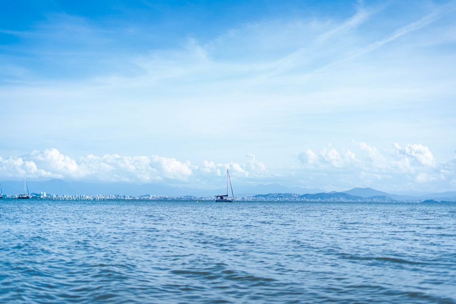
Boats also appear as part of larger scenes: a rowboat and a wooden landing in Mystic Hour, small boats at a dock in Life's Reward and House Near the Lake, a rowboat under the stone bridge in Mountain Village, and a distant sailboat on the horizon in Seaside Escape. They are all in the water designs if you want to compare them side by side.
If it is the water itself you are wondering about, our lake designs and how to paint water covers why those scenes are among the most forgiving in the catalog.
Water, easiest to hardest
Still water with a reflection
The most forgiving kind, and the most satisfying to get right. A reflection follows three rules, and a good design has already applied all three, so your job is to trust them rather than improve them.
A reflection is darker than the thing reflected. It is less saturated, so a red canoe reflects as a duller red. And it is broken, smeared vertically by movement in the surface rather than copied cleanly.
The one technique that helps: work the brush in vertical strokes through the reflection, in the direction the color would actually run. It is a small thing and it changes how convincingly the surface reads.
A moonlit or sunlit path on water
Moonlight Bay and Summer's Song both have one. It is a column of small, bright, irregular regions running from the light source toward the viewer, and it is where people over-reach, because the pots for it look pale and unimpressive.
Paint them exactly as numbered and keep the brightest ones small. A moon path that is too wide or too uniformly bright stops looking like light on water and starts looking like a stripe. Save the very lightest color for last and use less than feels right.
Breaking surf
The hardest water there is, and it appears in Seaside Escape and Be Still. Foam has no edge in life, and a numbered canvas has to render it as a couple of dozen near-white regions separated by lines that do not exist in the real thing.
Three things make it work. Fill every region of one number across the whole wave before moving on, so the values stay consistent. Do not add extra white anywhere, because the drama comes from the darker greens beside the foam and losing them flattens the whole wave. And where foam meets water, a slightly less-than-perfect edge reads better than a crisp one. Surf is the one subject where tidiness works against you.
Hazy, low-contrast water
Golden Hour is the outlier. A pale dawn beach in cream, peach and soft gray, with a lighthouse in the distance. There is no difficult shape anywhere in it, and it is still one of the harder designs we sell, because the colors are so close to one another that reading the numbers under poor light is genuinely difficult and a single misplaced region shows immediately.
Take it on with a good lamp overhead and plenty of time, not as a first canvas.
Painting the boat itself
The hull is a long, shallow curve, and the strokes should run along its length rather than across it. Acrylic keeps a faint bristle texture, and on a hull that texture reading lengthwise looks like planking. Across, it looks like scuffing.
The waterline matters more than anything else on the boat. Where the hull meets the water, keep the edge crisp and keep it exactly where it is drawn. A soft or wandering waterline makes the boat hover above the lake instead of sitting in it, and it is the first thing the eye notices.
Masts, oars, painters and mooring lines are the thinnest regions on the canvas. Leave them until everything around them is fully dry, use the narrow edge of a flat brush rather than a pointed one, and pull each in a single stroke.
A note on canvas care
You will find advice suggesting you iron a paint by numbers canvas to flatten it. Ours are pre-primed cotton and ship rolled in a tube rather than folded, so there should be nothing to iron out, and heat risks both the print and the primer. If a canvas needs settling, leave it flat under some heavy books overnight.
The easel that comes with a kit is on the framed sizes only, so do not count on one with an unframed canvas.
If the reflections and the warm-against-cool of these scenes interest you, the color wheel explains what distance and shadow do to a color, which is most of what makes water read as water.


