


Acrylic paint only became widely available to artists in the 1950s, which makes it the youngest of the major painting mediums. The painters below are the ones who worked out what it could do — and in several cases chose it specifically because oil could not do the same thing.
One note before the list. A lot of articles on this subject quietly assume every famous modern painting is acrylic. Many are not. Where an artist worked mainly in oil, or where a well-known painting is oil rather than acrylic, it says so below.
What acrylic paint actually is
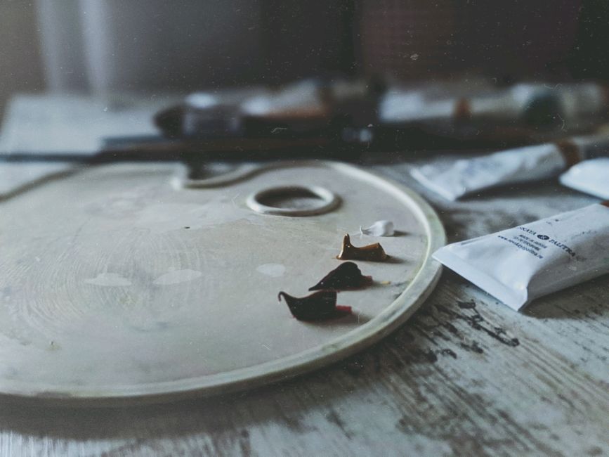
Pigment suspended in an acrylic polymer emulsion. It is water-based, so it thins and cleans up with water, and it dries by evaporation rather than the slow oxidation that oil relies on. A thin layer is touch-dry in minutes and fully cured in days.
That speed is the whole story. It let painters build layers in a single session instead of waiting weeks, and it made large flat areas of even color practical for the first time.
One thing worth stating plainly, because it appears as advice on a lot of sites: you cannot mix acrylic and oil paint together. They cure by different mechanisms and the result fails. You can paint oil over fully cured acrylic. Never the reverse.
How acrylic changed what painting could look like
Two things followed from the chemistry. Acrylic can be thinned to a stain that soaks into raw canvas, or built up thickly enough to hold a ridge — and it does both without the yellowing and cracking that oil risks at those extremes.
Painters took it in opposite directions almost immediately: some toward flat, saturated, hard-edged color, others toward pouring and staining. Both routes appear in the list below.
Ten painters who shaped acrylic
1. Andy Warhol
Warhol combined acrylic with silkscreened ink, which is what gives the Marilyn Diptych (1962) its particular quality — flat acrylic color underneath, mechanical printed image on top. It is a way of working that oil simply cannot support, because the paint has to be dry and non-absorbent before the screen goes down.
2. David Hockney
Hockney adopted acrylic after moving to California in the 1960s, and it suited exactly what he wanted: flat, matte, even color with no visible brushwork. A Bigger Splash (1967) is the one everybody knows — the still surface, the hard-edged building, and then the one moment of broken water.
3. Kenneth Noland
Noland worked on unprimed canvas with Magna, an early acrylic resin paint, letting color sit in the weave rather than on top of it. His targets and chevrons are about the relationship between color and shape with nothing else in the way.
4. Helen Frankenthaler
Frankenthaler invented soak-staining — pouring heavily thinned paint onto raw, unprimed canvas so it stains the fabric like dye. It changed what a generation of painters did next.
Worth being accurate here: Mountains and Sea (1952), the painting that started it, was oil, thinned with turpentine. She moved to acrylics later, once they became available, because they gave her the same effect without the oil eventually rotting the unprimed canvas. That is a genuinely good illustration of why acrylic mattered.
5. Robert Motherwell
Motherwell worked in both oil and acrylic. His Elegies to the Spanish Republic is a series of well over a hundred paintings made across roughly four decades from 1948 — black ovoid shapes pressed between vertical bars, returned to again and again. Individual works in the series are numbered, which is why you often see a single number quoted as though it were the title of the whole thing.
6. Bridget Riley
Riley is the op art painter, and precision is the point — her surfaces have no visible brushwork at all, because any texture would break the optical effect.
Her breakthrough work in the early 1960s was black and white, not color: curves, waves and dots that appear to move. The color stripe paintings people often picture came later in the decade and after. Her early works were frequently emulsion on board; she used acrylic extensively in the later color work.
7. Roy Lichtenstein
Born in New York City in 1923, Lichtenstein used Magna — the same acrylic resin paint as Noland — for the flat primary color and hard black outlines of his comic-panel paintings. From 1961 onward he built a style around printed imagery, and by the mid-1960s it was being shown seriously on both sides of the Atlantic.
8. Mark Rothko
Rothko belongs on any list about color and scale, though he is the weakest fit here on medium: his mature work is largely oil, sometimes with egg tempera and other mixtures, and acrylic appears only later and sparingly. He is included because the soft-edged floating rectangles are what half the painters on this list were reacting to or against.
9. Nathanaël Koffi
A contemporary French-Ivorian artist, born in 1995 and sometimes called the "Color Dealer." He works across canvas, sculpture and found objects — skateboards, metal, cars — and paints without sketches or advance planning, which is only practical in a medium that dries as fast as acrylic. He has worked with brands including Adidas and Ray-Ban.
He is by some distance the youngest painter here, and a useful reminder that acrylic's history is still being written.
10. Timothy Mulligan
A California painter who studied at Sacramento City College and took a Fine Art degree at CSU Sacramento, working under Gregory Kondos among others. He worked as a printmaker, stepped away from art for years to homeschool his children, and returned to painting in 2011.
His landscapes combine linear composition with strong color, sitting between representation and abstraction, and are held in collections including the City of Sacramento. He is the one name here you may not know, and the one whose work is most directly useful if you paint landscapes yourself.
A note on Willem de Kooning and abstract expressionism
De Kooning, the Dutch-American painter, gets attached to acrylic in a lot of articles. He worked mainly in oil, often deliberately slowed further with solvents and additives so he could keep scraping back and reworking — which is the opposite of what acrylic offers.
Abstract expressionism was not really a technique so much as a position: that the act of painting was itself the subject. Some of its painters took to acrylic quickly, and some had no use for it at all.
Glazing, if you want to try what they were doing
Glazing means laying a transparent layer of color over a dry one so the color underneath shows through and shifts. It is how you get depth that mixing on the palette cannot produce.
With standard acrylic the difficulty is drying speed — the glaze sets before you have finished moving it. Slow-drying acrylics, or a glazing medium, buy you the working time. Build up thin layers and let each dry fully. Our notes on layering acrylic paint cover the practical side, and the color wheel explains which combinations are worth attempting.
Where to start yourself
Looking at painters like these is inspiring and slightly paralyzing, because none of them tells you what to do on a blank canvas on a Tuesday evening.
If you want to build the hand skills without also solving composition and color mixing at the same time, a paint by numbers kit removes the decisions and leaves the brushwork. Ledgebay's designs are original artwork licensed from living painters rather than reproductions of famous works, and there is a custom option made from your own photograph if you would rather paint something personal.
You can see finished work in our customer gallery.


