


Two of our designs have a lighthouse in them, and they are almost opposites: one dramatic, one so quiet it is one of the harder canvases we sell. Both are worth understanding before you choose, because a lighthouse scene asks for a particular kind of restraint.
Why lighthouse scenes compose so well
A seascape is a stack of horizontals. Sky, horizon, water, shore. That is restful and it is also inert, because there is nothing for the eye to stop on.
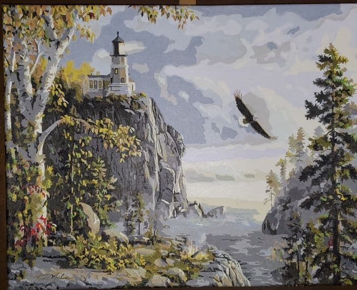
A lighthouse fixes that with a single strong vertical, and it does something else that painters value more: it explains the light. Every value in the picture has a reason once there is a light source standing in it, and that is why these scenes hold together even when very little is happening in them.
The two designs
Guiding Light
Guiding Light is a Kim Norlien painting. A white lighthouse stands on a rocky headland above a misty sea, an eagle crosses the pale sky, and a stand of dark pines closes the right-hand side. The palette is cool and restricted, mostly grays, greens and soft blue-whites, with the tower as the brightest thing in the frame.
It is a moderate canvas rather than an easy one. The rock and the foliage carry a lot of small shapes, and the sea is built from close values.
Golden Hour
Golden Hour is the quiet one. A wide, pale beach at dawn in cream, peach and soft gray, gentle surf, and a lighthouse and outbuilding small on the right-hand side. Painting the lighthouse itself — the tower, the light, the water around it — is its own small problem.
Be warned that it is genuinely demanding, and not for any reason you can see at a glance. There is no difficult shape anywhere in it. The difficulty is that almost every color sits within a narrow band of very light values, so the printed numbers are hard to read and a single region filled with the wrong pale gray shows up immediately. It wants a lamp directly overhead and an unhurried evening. It is not a first canvas.
Both sit with the rest of the water designs if you want to compare.
Painting a white tower
Here is the mistake almost everyone makes. The tower is white, so it gets treated as one flat white shape, and the result is a cardboard tube.
A lighthouse is a cylinder. A cylinder in daylight has a lit side, a broad mid tone, and a shadowed side that turns away from the light, and the shadow is never gray-of-white but takes its color from what is around it: blue from the sky, warm from a low sun. A well-made kit gives you three or four barely different pale colors for exactly this, and they will look almost identical in the pot.
Do not simplify them. Those small separations are the entire reason the tower will look round. Paint them exactly as numbered, and work the brush vertically, along the length of the tower, so the faint bristle texture follows the form.
The lantern room at the top is the smallest and brightest passage on the canvas. Paint it last, once everything around it is fully dry, with the smallest brush you have, and use less paint than feels right. A light that is slightly too small still reads as a light. One that has spread into the sky reads as a smudge.
Rock, and the trick that makes it look wet
Headland rock is the busiest part of either canvas, and the temptation is to hurry it. It is worth slowing down for one specific thing.
Dry rock above the tide line is warm and matte. Rock at and below the waterline is darker, cooler and reflective, and the narrow dark band where the two meet is what tells the eye the sea is actually wet. If you flatten that band into the same tone as the rock above it, the whole shoreline goes dry and the water stops being water.
Elsewhere, follow the direction of the strata with the brush rather than scrubbing across it. Rock has a grain and it runs somewhere.
Mist and haze
Both designs use haze, and haze is the hardest thing in either of them to read, because it is a set of near-identical pale grays sitting next to each other. Two habits solve most of it: a lamp directly above the canvas rather than behind your shoulder, and photographing an unreadable patch with a phone and zooming in.
Then fill every region carrying one number across the entire hazy area before you move to the next, so the values stay consistent. Working region by region through close grays is how people end up with a patch of sky that does not match the sky beside it.
Resist adding contrast. Haze works because there is very little difference between its parts, and every kit that reproduces it well will look underdone until the darker elements around it go in.
The eagle
In Guiding Light, the eagle is a small dark silhouette against the palest part of the sky. It is the highest-contrast thing on the canvas, which makes it look far more important than its size suggests.
Leave it until last, when the sky is completely dry. Keep it exactly the size it is drawn. Widening a wingtip by a fraction turns a bird into a blot, and there is no undoing it on that pale a background without repainting a large area of sky.
Two things not to do
Do not iron the canvas. Ours are pre-primed cotton and ship rolled in a tube rather than folded, so there should be nothing to flatten, and heat risks the print and the primer. If a canvas needs settling, leave it under heavy books overnight.
And if a pot has thickened, stir in a single drop of water rather than tipping water in. Paint does not spoil sitting on a table, but over-thinned paint will not cover the printed number and cannot be un-thinned.
If you like these scenes, our piece on boat and water designs ranks the water in the whole catalog by how demanding it is, and the color wheel explains why a shadow on a white tower is not gray.


