


Winter designs are the most popular thing we sell in the second half of the year, and they are painted differently from everything else. Snow is not white, night skies fail if you lighten them, and every one of these canvases has a small bright thing on it that has to be saved until last. Clouds work the same way, with the brightest edge left until the end.
Here are the three we actually make, and how to paint them.
The three winter designs
Aurora Bliss
Kim Norlien's log cabin under the northern lights. Green and violet ribbons of aurora across a star-filled sky, a cabin deep in snow-loaded pines with its windows lit gold, and a campfire burning down on the bank of an open stream, with the fire and the lights coming back off the water in long broken reflections.
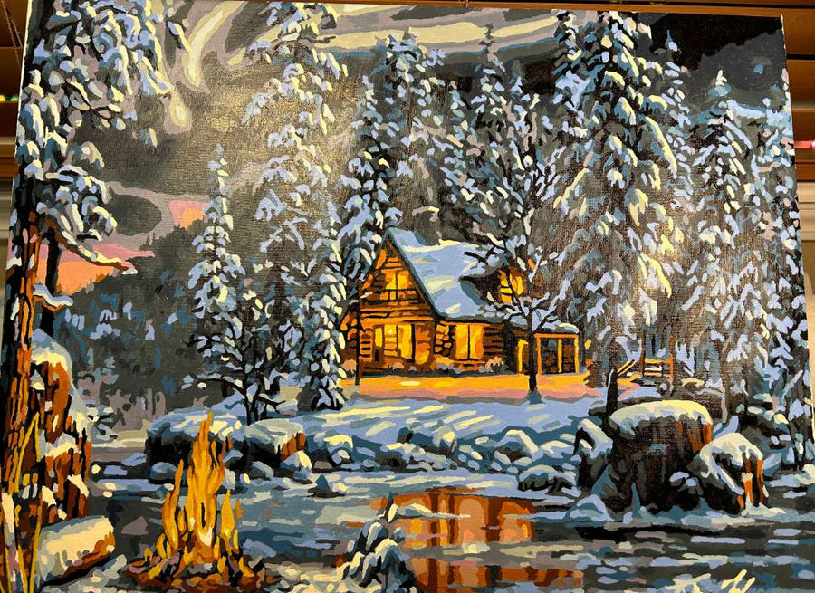
A good choice if you want a night scene rather than another daylight landscape, and more forgiving than it looks — the aurora and the snow go in as broad sweeping bands. The lit windows and the fire reflections are the fiddly part.
Christmas Magic
Abraham Hunter's snowbound cottage with Santa's sleigh drawn up outside: eight harnessed reindeer, wreaths in every window, a lit tree inside, garland along the eaves, and warm light falling across the drifts in long patches. Rabbits, a fox, a cardinal and a pair of deer are scattered through the snow.
The obvious one to paint in the run-up to Christmas and a common gift, but not a beginner's kit — eight reindeer means eight sets of antlers and harness. Allow six weeks if it needs to be finished and framed as a present, working an evening or two a week. The snow and sky are broad and easy; everything else is fine work.
Moonrise Song
Three wolves under the northern lights at the edge of a frozen stream, from Abraham Hunter. Reviewers call it difficult and tedious, and also say it turned out beautiful and looks superb framed. Both are true. The sky and snow are the easy part; the wolves are a great many narrow gray and cream sections. Budget nearer 25 hours than 15.
Two that get called winter and are not
Worth saying, because both come up in searches for winter designs. October is a Judy Buswell autumn still life — zinnias, poppies and cosmos in ceramic pitchers, warm and sunlit. Mountain Paradise has a snow-covered peak in the background but the maples have turned, so it is an autumn scene, and it is one of the best first canvases we sell for an unrelated reason: a reviewer describes its lines and numbers as clear enough to read without reading glasses at all.
why it holds up in winter is less about the subject on the canvas than about having something to do with a dark evening.
Snow is not white
This is the single most useful thing on this page.
Look closely at any good winter painting and the snow is painted in blues, violets and grays, with genuine white used only in a few places where the light hits directly. Hunter does this consistently, and it is precisely why the animals in his snow scenes read so clearly — the snow is a mid-tone, so a wolf or a deer can sit darker or lighter against it.
our winter scenes and how to paint snow covers the rest, starting with how little white is actually in a snow canvas.
What this means when you are painting: trust the numbered tones even when the pot looks too blue or too gray to be snow. The instinct to reach for white and brighten it is the most common way a snow scene gets flattened. Filled in as printed, the snow reads correctly the moment you step back, and the few true whites do the work of looking like snow.
Night skies want to be dark
The same discipline applies upward. A night sky in the pot looks alarmingly dark against a bare canvas and the temptation is to thin it or lighten it.
Do not. Lit windows, a campfire and an aurora only glow because the dark around them is genuinely dark. A timid sky leaves the whole canvas looking gray and washed out, and there is no way to fix it afterward without repainting the sky.
Save the bright things for last
Every winter design here has a handful of small bright elements — lit windows, a fire, a reflection on water, a moon. These go in last, onto completely dry dark paint.
A gold window laid onto dry navy stays gold and crisp. The same gold laid into navy that is still tacky turns muddy green-gray immediately, and second coats never fully recover it. This one sequencing decision accounts for most of the difference between a night scene that glows and one that does not.
Painting an aurora
Easier than it looks, and worth knowing before you are put off by one.
The aurora is broken into wide numbered bands that all run in the same direction. Lay them in one after another, following the direction of the band with your brush, and stop. The blend appears on its own from a normal viewing distance — the bands are doing the work. Trying to soften the boundaries between them by hand generally makes it worse, because acrylic sets before you have finished the length of the stroke. Night and moonlight scenes are where that bites hardest, because the gradients are long.
Reflections on water and snow
Winter scenes are full of them: firelight on an open stream, window light across drifts. Two rules cover almost all of it.
Reflections run vertically, roughly straight down from whatever is being reflected, and they break up rather than forming a clean mirror image. And they are always less bright than the source. A reflection painted as bright as the fire itself looks like a second fire underwater.
Paint the water or snow surface first, let it dry, then pull the reflection down over it in vertical strokes.
Choosing a size and a finish
Each design comes in three versions rather than two: framed 12x16, framed 16x20, and unframed 16x20.
Take the 16x20 if you can. The section count is identical at both sizes, so the smaller canvas gives you the same detail in less space, which makes it the harder painting rather than the quicker one. That matters more on winter designs than most, because the fine work is concentrated in small bright details.
Framed sizes arrive pre-stretched on a wooden frame and are ready to hang, and include a wooden tabletop easel. The unframed canvas is the same design and paints for less, but it is trimmed close to the printed edge, so plan to tape or mount it to a board rather than stretch it over a frame of your own.
Common questions
Which winter design suits a first canvas?
Aurora Bliss, of the three. The aurora and snow are broad and forgiving, and the detail is limited to the cabin and fire. Christmas Magic and Moonrise Song are both genuinely detailed. The Christmas and cabin designs are the ones people come back for.
When should I start a Christmas design?
Six weeks ahead if it is a gift. These are 10 to 20 hours of work and the last stretch is the fiddly part, which is the worst thing to be rushing in December.
Why does my snow look flat?
Almost always because it has been lightened. Snow needs its blues and violets to have any form at all. If it is already flat, the fix is glazing a thin blue-gray back over the shadowed areas rather than adding more white.
Can I have a winter photo of my own made into a kit?
Yes. Snow photographs convert well because it is naturally high contrast. A custom canvas from your photo comes in 12x16, 16x20 and 18x24. Choose a shot with real shadows in the snow rather than flat overcast light, which gives the conversion nothing to work with.
The full range is in the shop, and the customer gallery has a good number of finished winter canvases in it.


