


Color therapy is not a medical treatment, and we are not going to pretend otherwise to sell you a canvas. The idea that particular colors treat particular conditions has been around for a long time and has never held up when tested properly. If you have arrived here because of something you are actually dealing with, please take that to somebody qualified rather than to a paint tray.
What is left after you strip out the overclaiming is still worth having. Color does affect how a room feels and how a person feels in it. And the act of painting does something more reliable than any individual color does. Both are worth understanding before you choose a design.
What color genuinely does
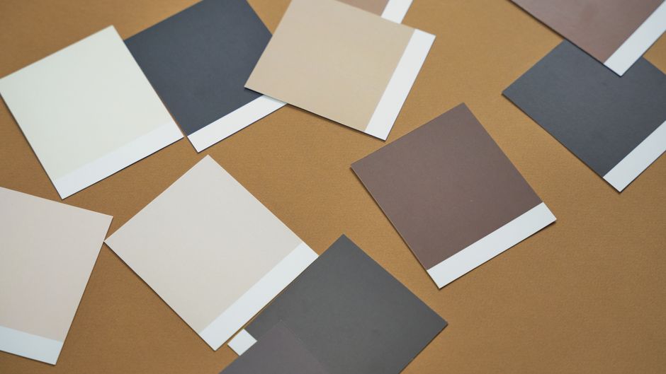
The honest version is narrower and more interesting than the version usually sold.
Warm and cool are real. Reds, oranges and yellows read as advancing and energetic. Blues and greens read as receding and settled. This is consistent enough that painters and interior designers rely on it, and it is why a blue-green room feels larger and calmer than the same room in terracotta.
Association does most of the work. Green reads as restful largely because of what it is attached to — foliage, water, open ground. That is learned, not a property of the wavelength, which is why the associations shift between cultures and why nobody should be told that a specific color will produce a specific feeling in them.
Saturation matters more than hue. A muted red and a fully saturated red do not feel remotely alike. When people describe a painting as calming, they are usually responding to low saturation and a narrow value range rather than to which colors were used.
Where those colors sit next to each other changes everything again, which is what the color wheel is for.
The part that actually helps is the painting
Across our own customer reviews, calm and focus come up unprompted more than any other theme. People describe the same thing in their own words over and over: an hour where their attention was fully occupied, and an evening that left something behind instead of disappearing.
There is a plain mechanism for this and it is not about color at all. Painting freehand carries a constant load of decisions — what to draw, what to mix, whether it is working. A numbered canvas removes those decisions. What is left is a repeatable physical task with visible progress, which is a good deal easier to sink into than a blank canvas is. That is why people who describe themselves as having no artistic ability still find these absorbing.
Choosing a design by its palette
If mood is what you are choosing on, choose on the palette rather than the subject. Here is how the catalog divides up.
Cool and settling. Northwoods Retreat is a moose at a lake among birches, built on strong blues and greens. Moonlight Bay is a canoe on moonlit water. Away From it All is a small pine island on flat, calm water. These are the quietest things we make.
Warm and low-contrast. Golden Hour is a shoreline at dawn in close pale golds, and Morning Glory is an egret over a marsh under a gold sky. Both are gentle to look at and, because there is so little contrast, slower to paint than they appear.
High color and high energy. Beautiful Sunset in Amsterdam and Orchard Puzzle are the busiest and brightest. They are engaging rather than restful, and they demand more attention while you work.
Quiet neutrals. Cosmos From the Garden is pale and chalky, mostly soft pinks and grays. It is the design to choose for a room that already has plenty going on in it.
You can see how finished work of all of these actually looks in our customer gallery, which is more useful than any description because the photographs are taken in ordinary rooms rather than a studio.
What to ignore
Charts that assign a condition to a color. Claims that painting a particular hue will change your sleep, your blood pressure or your immune system. Anything that describes color as an energy that needs balancing. None of that has evidence behind it, and the honest case for sitting down with a canvas does not need it.
A reasonable way to use any of this
Pick the design because you want to look at it every day, not because a chart says the color will do something to you. Then set up so the painting itself is pleasant: decent light, a chair that suits the table height, and short sessions rather than marathons. The whole catalog is in one collection, and it is worth browsing by the artwork rather than the names, because the titles are not always a good guide to what the picture actually shows.


