


Wave painting is not difficult because water moves. It is difficult because most people paint what they know is there instead of what they can see. A wave is not blue with white on top. Look at one for a minute and it is green where the light comes through, near-black in the trough, warm gray in the shadow under the foam, and the foam itself is rarely white at all.
Get the values right and a wave reads as water even if the brushwork is loose. Get them wrong and no amount of detail will save it. This guide is about seeing first and technique second.
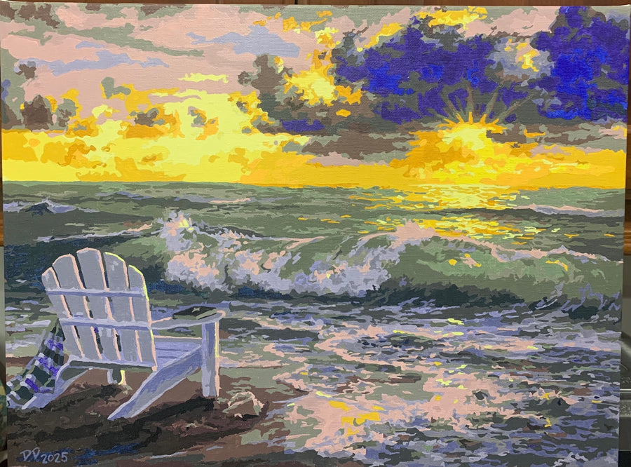
Why the sea is the color it is
Two things make ocean water blue, and knowing which is which tells you what to mix.
First, water itself absorbs light unevenly. Reds and oranges are absorbed within the first few feet, while blue passes through and scatters back. That is why deep water is blue from directly overhead, with no sky in the picture at all, and why the color deepens as the water gets deeper.
Second, the surface reflects the sky. This is the part beginners underuse. On an overcast day the sea goes gray, not blue, because the sky is gray. At sunset the water carries orange and pink across the flat areas between waves. If your sky and your water do not share colors, the painting will look assembled rather than observed.
The practical consequence: mix your water from the same pile of paint you mixed the sky from. A little of the sky color stirred into every water mixture ties the whole thing together in a way that no amount of careful edge work will.
The anatomy of a breaking wave
A wave has four parts worth painting separately, and they are almost never the same value.
- The face. The wall of water rising toward you. Usually the darkest large area, and usually the most saturated color in the picture.
- The window. Where the wave thins near the crest, light passes through from behind and it glows green or turquoise. This is the single detail that makes a painted wave look like water, and it is the one most beginners leave out.
- The lip and the spray. The crest tipping over, and the mist blown off it. Soft edges, not hard ones.
- The foam. The churn where the wave has already broken, running back toward the beach in lace-like patterns.
The values matter more than the colors
Look at a wave in black and white, as above, and the structure becomes obvious in a way that color hides. The trough is nearly black. The window is nearly as light as the foam. The face sits somewhere in the middle.
Squinting at your reference does the same job. If you cannot see three clearly different tones when you squint, your painting will read flat no matter how many colors you use.
Foam is not white
This is the most common mistake in the whole subject. Pure titanium white straight from the tube, dotted along the crest, is what makes an amateur seascape look like an amateur seascape.
Real foam is white only where the light hits it directly. Everywhere else it is in shadow, and takes on the color around it: blue-gray in the shade of the wave, warm cream in late light, green where the water shows through. Mix your white with a touch of the water color and reserve the pure white for a few small highlights on the sunlit edge. Fewer, brighter highlights read as more convincing than many dull ones.
Distance softens everything
Waves near the horizon are smaller, lower in contrast and cooler in color than the one in front of you. Paint the distant water as a few soft horizontal bands with almost no detail, and save the sharp edges and the bright whites for the foreground.
Two related rules that save paintings. Keep the horizon line dead level, because a tilted horizon is the first thing the eye catches and it makes the sea look like it is draining off the canvas. And keep detail out of the far distance entirely. Loose distant water is not laziness, it is what distance actually looks like.
Materials that suit water
Paint
Acrylic and oil both work, and they suit different temperaments rather than different subjects.
Acrylic dries in minutes. That is an advantage for layering foam over water without the two mixing into mud, and a disadvantage for blending a soft gradient across a sky. If you want to blend, work fast or use a retarder medium sold for the purpose.
Oil stays workable for days, which makes soft transitions easy and makes wet foam edges genuinely simple. The cost is drying time, and the solvents. Water-mixable oils are a reasonable middle path if fumes are a concern.
A small palette goes a long way here: a warm blue, a cool blue, a green, a yellow, an earth color and white. Prussian and phthalo blue are both very strong, so add them to white rather than the other way round.
Canvas, and the one thing that actually matters
Canvas is cotton or linen. Linen is finer and more expensive; cotton is what most people use and is perfectly good. Neither choice will decide whether your wave works.
What does matter is the priming, and this is where a lot of bad advice circulates. Most pre-stretched canvas sold today is primed with acrylic gesso, described as universally primed. You can paint acrylic or oil on it. Some canvas, usually more expensive and sold for oil painters, is oil-primed. Do not use acrylic on an oil-primed canvas. Acrylic does not bond to an oil ground and will lift off later. If the label does not say, it is almost certainly acrylic-primed and you are fine either way.
Brushes
Synthetic brushes are the better choice for acrylic. Natural hair swells in water and loses its point, and acrylic is hard on it. For oils either works.
Three shapes cover a seascape. A large flat for the sky and the broad water. A medium filbert, with its rounded corner, for the curve of a wave face. And an old, splayed, slightly ruined brush for foam and spray, dragged almost dry across the surface. That last one is not a real brush type. It is whichever brush you have already worn out, and it will do a better job on foam than anything you can buy.
Practice that actually improves this
Paint the same wave five times rather than five different waves once. Waves repeat, and the fifth attempt at one photograph teaches more than five first attempts at five.
Work from still photographs before video. A frozen wave is a shape you can study. A moving one is a shape you are guessing at.
And start small. An 8 x 10 study takes twenty minutes and costs nothing to abandon. Large canvases early tend to produce careful, timid paintings, because you are frightened of ruining the surface.
If you would rather not mix the colors yourself
There is a version of this that skips the color decisions entirely. A numbered canvas has the values already worked out by the artist who painted the original, which means you get the experience of laying in a wave without having to judge whether that trough is dark enough.
Several of our designs are water subjects. Moonlight Bay, Still Waters, Sunset Swans and Seaside Escape are the calmer ones, built from broad areas and reflected light. Seaside Paradise is the demanding one, and worth knowing that before you start rather than after. The whole range is in the collection, and the beginner's guide covers how a first canvas goes.
Painting a numbered seascape is also a genuinely good way to learn this subject. You spend several hours looking closely at how another painter handled foam and shadow, which is most of what a workshop would teach you.
Common questions
What is the hardest part of painting water?
Restraint. Water tempts people into detail, and detail is what kills it. The convincing parts of a seascape are large simple shapes with three or four accurate values.
How do I paint sea spray without it looking like dots?
Load a dry, splayed brush with very little paint and drag it lightly so the canvas texture breaks up the stroke. Spray has soft edges. Anything with a crisp outline reads as a speck of paint, not as mist.
Can I mix oil and acrylic in the same painting?
Oil over dry acrylic is fine. Acrylic over oil is not, and will eventually flake. If you are combining them, acrylic goes underneath.
Should I sketch first?
A rough tonal sketch, yes. Not an outline drawing, which encourages filling in shapes, but a five-minute scribble that works out where the darks and lights sit. Ten minutes here saves an hour of adjustment later.
My colors have gone muddy. What happened?
Usually too many colors mixed together, or working back into half-dry acrylic and dragging the layer beneath into the new paint. Let a layer dry completely and paint over it rather than blending into it.


