


Blurring a paint by numbers canvas means softening the edges between sections. It is the single change that most makes a finished kit look painted rather than filled in, because the hard boundary between one numbered shape and the next is the thing that gives a kit away. Soften those boundaries and the eye reads a painting instead of a diagram.
You do it after the numbers are covered, not instead of covering them. Paint the kit as printed, then go back and blend the edges you want to lose.
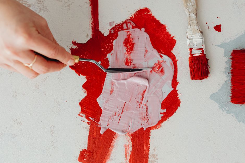
Edges, and why painters talk about them
An edge is the transition between two areas of color. Painters generally sort them into four kinds, and knowing the vocabulary makes the rest of this straightforward.
- Hard. A crisp boundary with no transition. This is what every paint by numbers section has by default.
- Firm. Slightly softened, still clearly a boundary. Useful for things that are solid but not the subject.
- Soft. A visible gradient between the two colors. This reads as blur.
- Lost. The two areas merge and you cannot say where one ends. Used at the outer edges of a form to let it sit back into its surroundings.
Real objects do not have uniform edges. A hard edge where a roofline meets bright sky, a soft one where a cheek turns away from the light, a lost one where a dark tree disappears into a dark hillside. Varying them is what creates depth.
Three reasons to blur
To control where the eye goes. Keep hard edges on the subject and soften everything around it. On a landscape with a figure in it, sharpen the figure and soften the background, and the picture suddenly has a point.
To suggest movement. Softening the trailing edge of anything that should be moving, water, a bird's wing, blown grass, reads as motion.
To push things back in space. Distant hills in life are hazier and lower in contrast than nearby ones. Kits usually print them with the same crisp edges as the foreground, and softening them restores the depth.
For the extreme version of this, the South African painter Philip Barlow is worth looking up. Born in 1968 and working in Cape Town, he paints city scenes entirely out of focus in oil, so streetlights and headlights become soft discs of color in the way a camera lens renders them. Nothing in the picture is sharp, and the subject becomes the light itself.
Which medium makes this easy
Worth correcting a claim that circulates a great deal, including in the older version of this page: watercolor is not the hard medium for soft edges. It is the easiest. Wet-in-wet, where you drop color into an already damp area and let it spread, is the most natural blur in painting.
The genuinely awkward one is acrylic, which is what comes in a paint by numbers kit. Acrylic dries in minutes, so the window in which two colors can be blended is short. Oil is the most forgiving because it stays workable for hours. None of this means it cannot be done in acrylic. It means working small and working quickly.
How to soften an edge in acrylic
- Work one short stretch at a time. A couple of inches of edge, not the whole boundary. Trying to blend a long edge guarantees the first end dries before you reach the second.
- Lay both colors down fresh. Put the two colors on either side of the edge while both are still wet. You cannot blend into paint that has already set.
- Use a soft, slightly damp brush. A clean flat or filbert, damp rather than loaded, worked back and forth along the boundary with a light touch. Small strokes across the edge, then a few along it to even out the transition.
- Stop before it turns to mud. Overworking mixes the two colors into a single flat band, which is a different and worse result than a gradient. Two or three passes is usually enough.
- Wash the brush between edges. Color carried from the last blend into the next is the most common way this goes wrong.
A note on dry brushing, which older instructions recommend for this: it does the opposite. A dry brush with very little paint skips across the texture of the canvas and leaves a broken, scratchy edge. That is a useful effect in its own right, for weathered wood or sparkle on water, but it is not blending.
If the paint keeps setting before you finish, an acrylic retarder or slow-drying medium bought for the purpose will extend your working time. Buy the actual product rather than mixing something at home, because household substitutes change how the paint film cures and can leave it permanently tacky.
Blending an edge that has already dried
Once acrylic is dry you cannot blend into it, but you can glaze over it. Thin a little of one of the two colors heavily with water or a glazing medium until it is close to transparent, and brush it across the boundary. It will not fully dissolve the edge, but it knocks the contrast down and reads as softened. Several thin glazes work better than one thick one. Our guide to the glazing technique covers this in more detail, and layering acrylic paint explains how the coats build.
Which edges to leave alone
Do not soften everything. A canvas with no hard edges anywhere looks out of focus rather than atmospheric, and the eye has nowhere to rest.
Pick one focal area and keep it crisp. On a landscape that might be a cabin or a single bird. Then work outward, softening more the further you get from it. The general rule is that hard edges advance and soft edges recede, so anything you want to sit at the back of the picture should be softened and anything at the front should stay sharp.
Two things that do not work
Laying tracing paper or frosted film over the painting. This gets recommended and it is not blurring, it is covering. It veils the whole surface uniformly, kills the color, and comes off the moment anyone touches it.
Blurring it in Microsoft Paint. Paint has no blur tool. The brush options it does offer, oil, crayon, marker and the rest, change how a stroke is drawn and do nothing to an existing image. If you genuinely want a digital version, photograph the finished canvas in even light and use software that has a real blur filter. But that gives you a picture of your painting, not a painting, which is a different object.
Practicing on a kit first
This is a good reason to try the technique on a numbered canvas before a blank one. The composition is already resolved and the colors are already chosen, so you can concentrate on the one skill. Edge control transfers directly to freehand painting, where it is one of the things that most separates a picture that works from one that does not.
Our kits are acrylic on pre-primed cotton canvas, rolled in a tube rather than folded, with brushes in a range of sizes and an 11 x 17 reference print. The landscapes take to this technique best because they have large areas of sky, water and distance to soften. You can browse the full catalog, or turn your own photograph into a canvas with custom paint by numbers from a photo.
If you are still getting comfortable with the basics, start with paint by numbers for beginners. To see how other people's finished canvases turned out, the customer gallery is all real paintings sent in by the people who made them.


